

Card
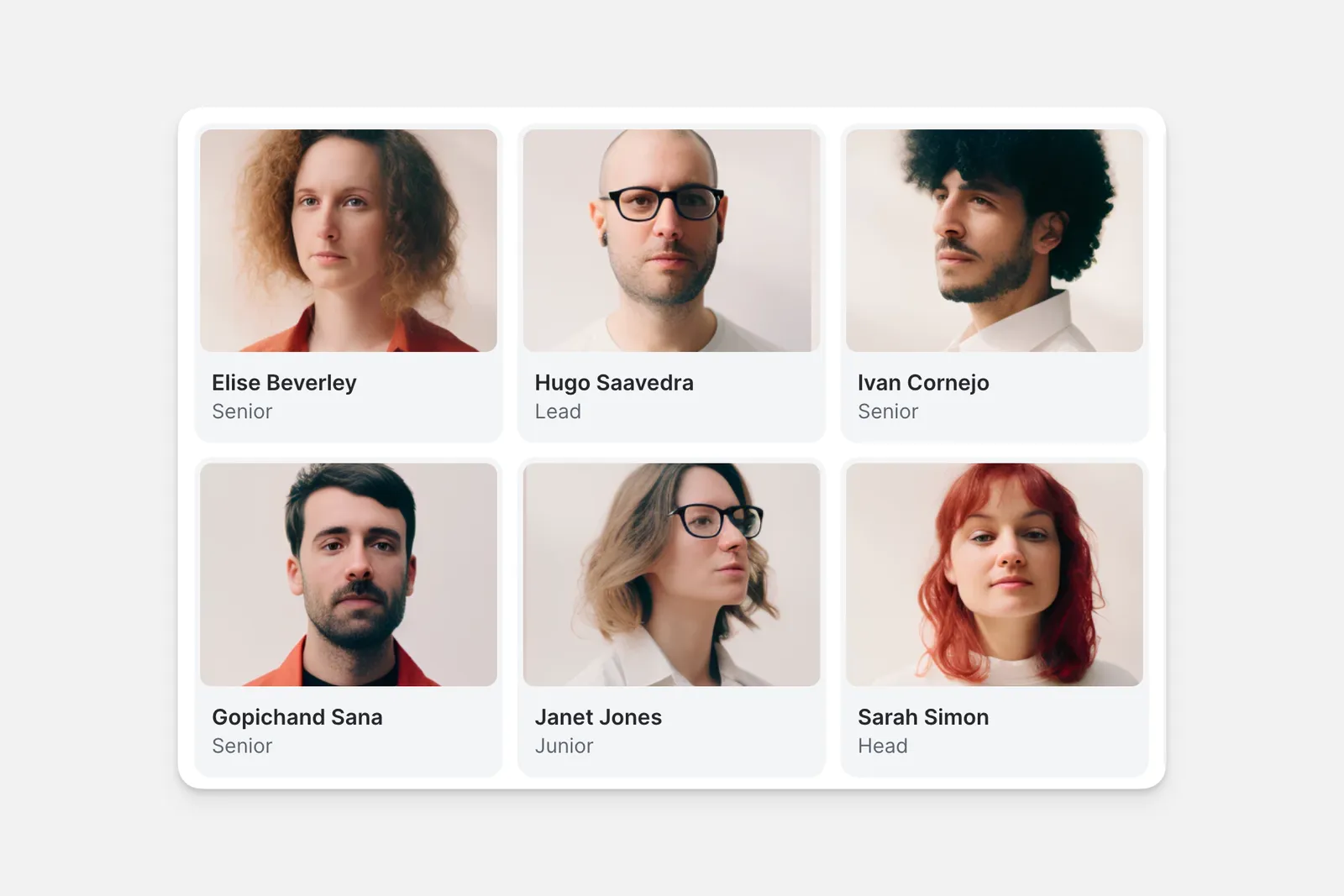
The Card Component is a special type of Collection Component that allows you to display items in a grid. It’s a great choice when you want images to be the focus in your list like with collections of homes, products, or digital art. When users click on a card, more details about that item are displayed.
Adding and Setting Up Card Collections
To set up your Card Collection:
In the Layout Editor of your app, click the plus (+) symbol to add a new component.
Choose what Data Source it should use.
Choose if you’d like to limit the number of items that appear, as well as how many items to show per page.
Set Visibility Conditions for your data if needed.
To update your Card Collection, go to the Components section, click on your collection, and make your desired changes. You can preview each change live as you make adjustments.
Adding an Action to your Collection
You can add Actions to your Card Collection to allow users to interact with your data. For example, you can add a Button that takes users to a detailed view of a record or opens a form to submit information to you.
Frequently Asked Questions
Can I limit the number of items displayed in my collection?
Yes, you can set the number of items displayed in your collection by using the Limit setting in the Collection component.
How can I get notified when a new item is added?
Yes, add an action step when a new item is added to send a Slack message, email, or any other notification Glide supports through Actions and Integrations.