Container
The Container component acts as a parent inside which you can add child Components. This allows you to style, arrange, and add conditions to groups of Components.
Adding and Setting Up the Container Component
In your Layout Editor of your app, select the tab you want to edit.
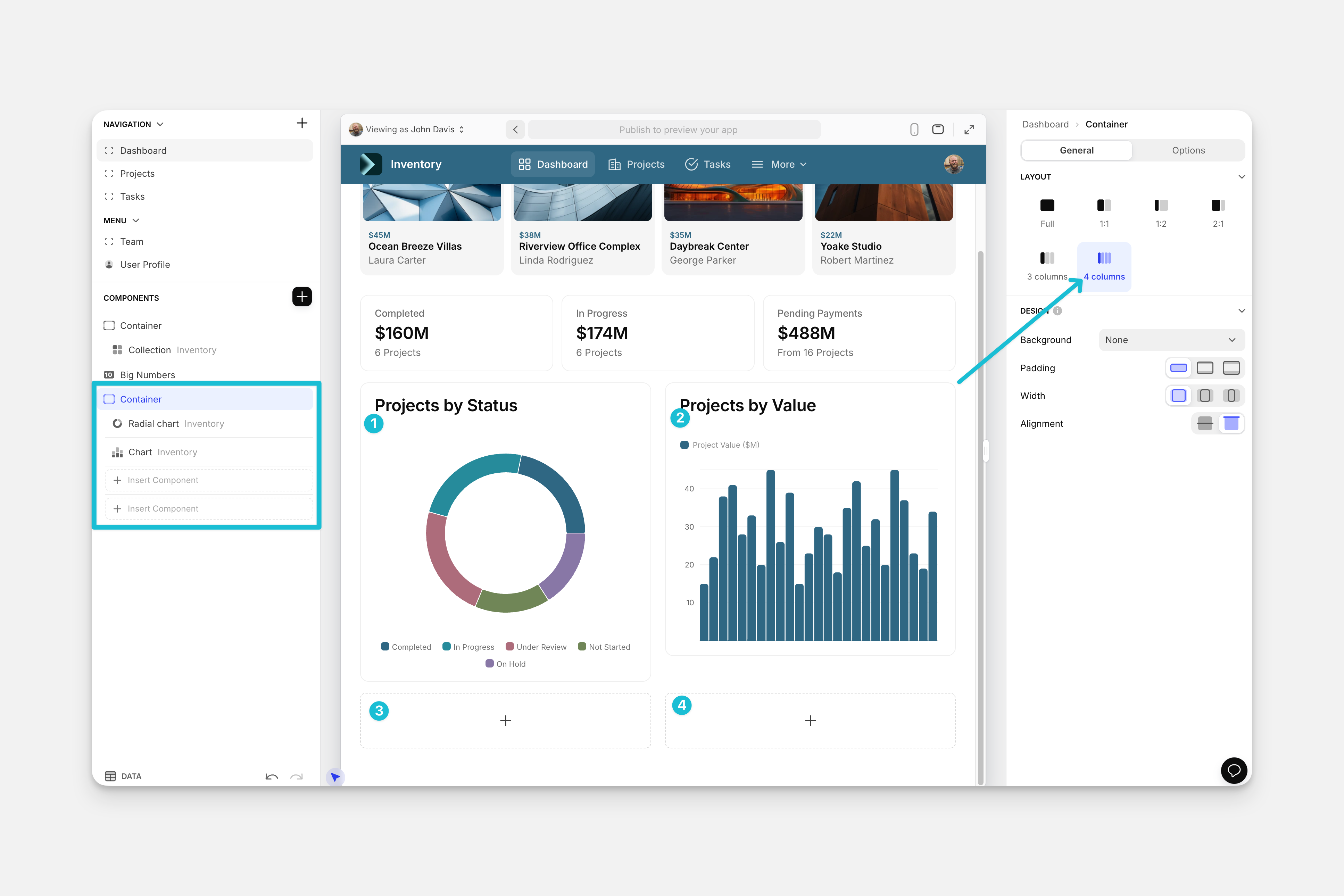
The Container component allows you to create column layouts and arrange components side-by-side. For example, the app below shows a side-by-side layout using two columns.
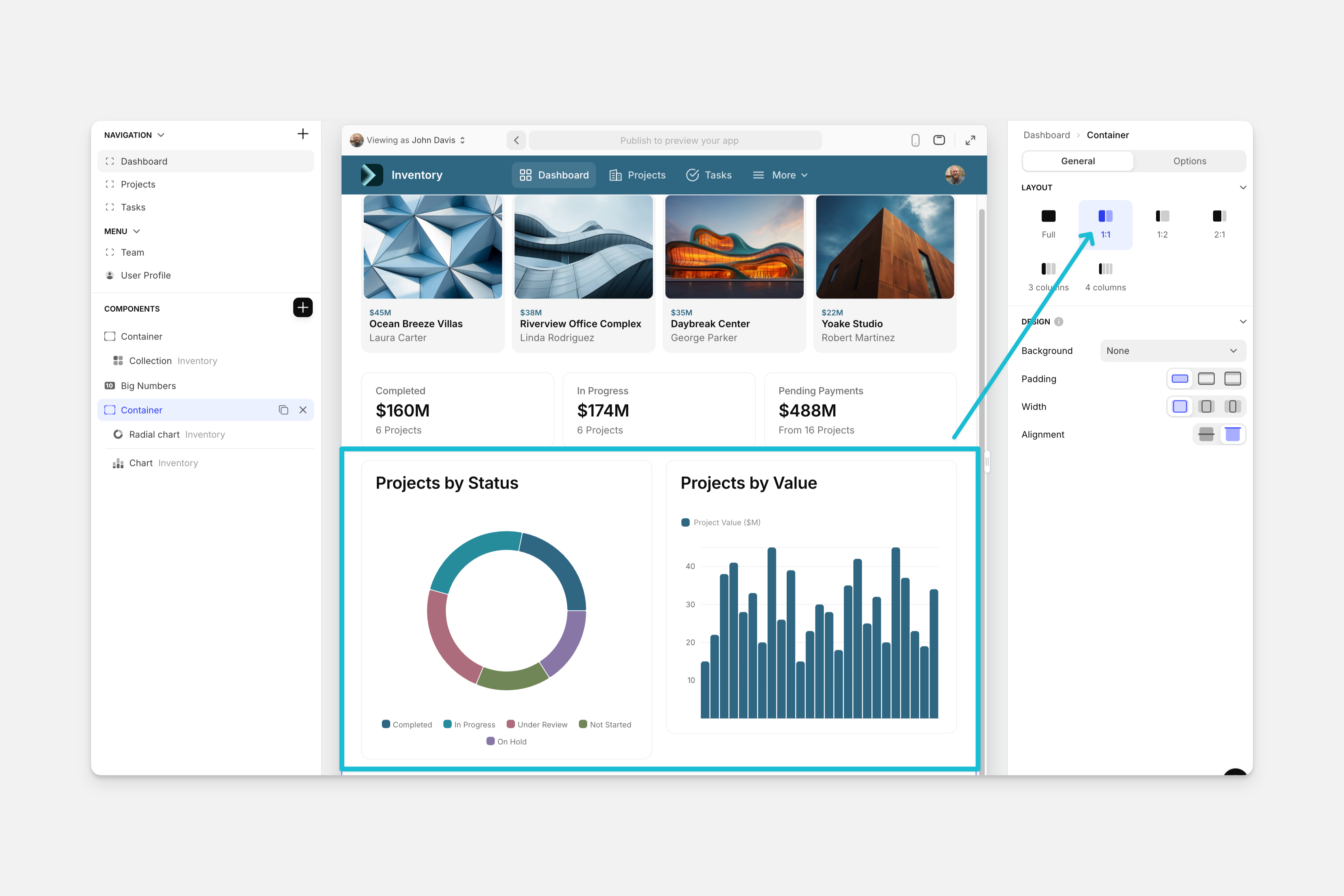
When you choose a layout that is more than one column you’ll see sections underneath the Container Component with dividers. This shows you the different sections for your container which will change depending on the number of columns you have.
Design
In the General tab on the right side of the Layout Editor, locate the Design section. The Container component allows you to configure the following design options:
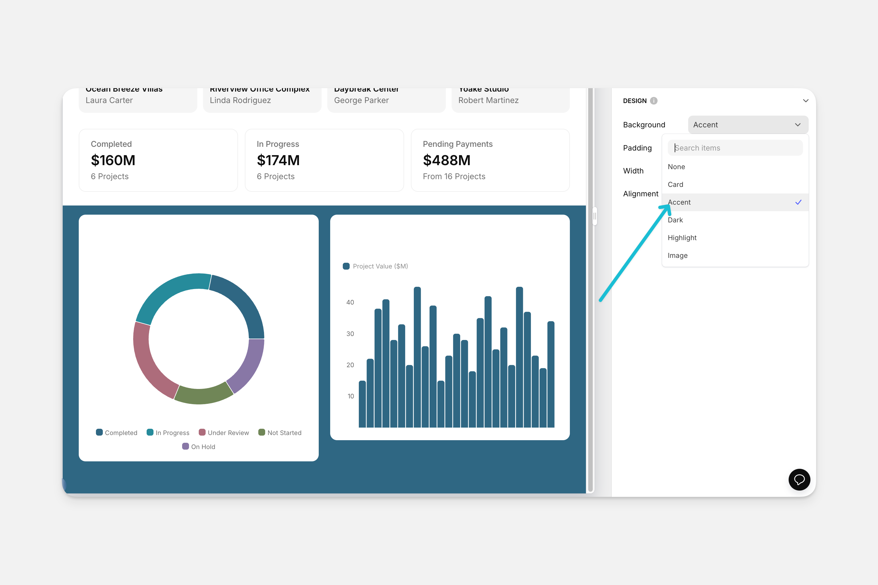
- Background for your Container: None, Card, Accent, Dark, Highlight, or Image.
- Padding: Normal, Large, or XLarge
- Width: Large, Medium, or Small
Conditions
Sometimes you want to set the same Visibility Condition on multiple components. Rather than creating the same condition on each individual component, you can group them all into a container and set one condition on that container.
Tabs Component for Nesting Containers
If you have existing containers that you want to nest into a tabbed view, you can use the Tabs component to create this functionality in Glide. The Tabs Container component itself cannot hold containers. To create a tabbed view with existing containers and the Tabs component, you will need to set up the Tabs component in addition to making visibility adjustments to the existing containers.
Setting up the Tabs Component
Feature in Beta
This feature is in beta. Features in beta can be unpredictable and may change as development continues. The Glide Support team does not provide help with these features. Please post any questions in the Community forum.
In the Data Editor, create a column to store your tab names.
In the Layout Editor, select the screen you want to edit. This screen should already have the containers you want to add to the tabbed view.
Choose Line or Button style. This will either underline the Tab name in the interface or put a shaded box around it.
Toggle Full width on mobile to spread tabs evenly out across the width of a mobile device. This will create padding and center the tabs on the screen, rather than aligning them to the left.
Click the default Tab to customize its configuration. You can choose a Name, a Display as name, an icon, and enable badge functionality. If no Display as data is provided, then the Name field will be used as the public name of the tab.
- Note: each tab name you enter will be stored in the column you selected for the Selected tab field
Configuring Visibility Conditions to Nest Containers
Make note of the column name that stores your tab names. You will need this information for this setup.
The default condition will be Show component when. Now, select the column that stores the tab names you created.