

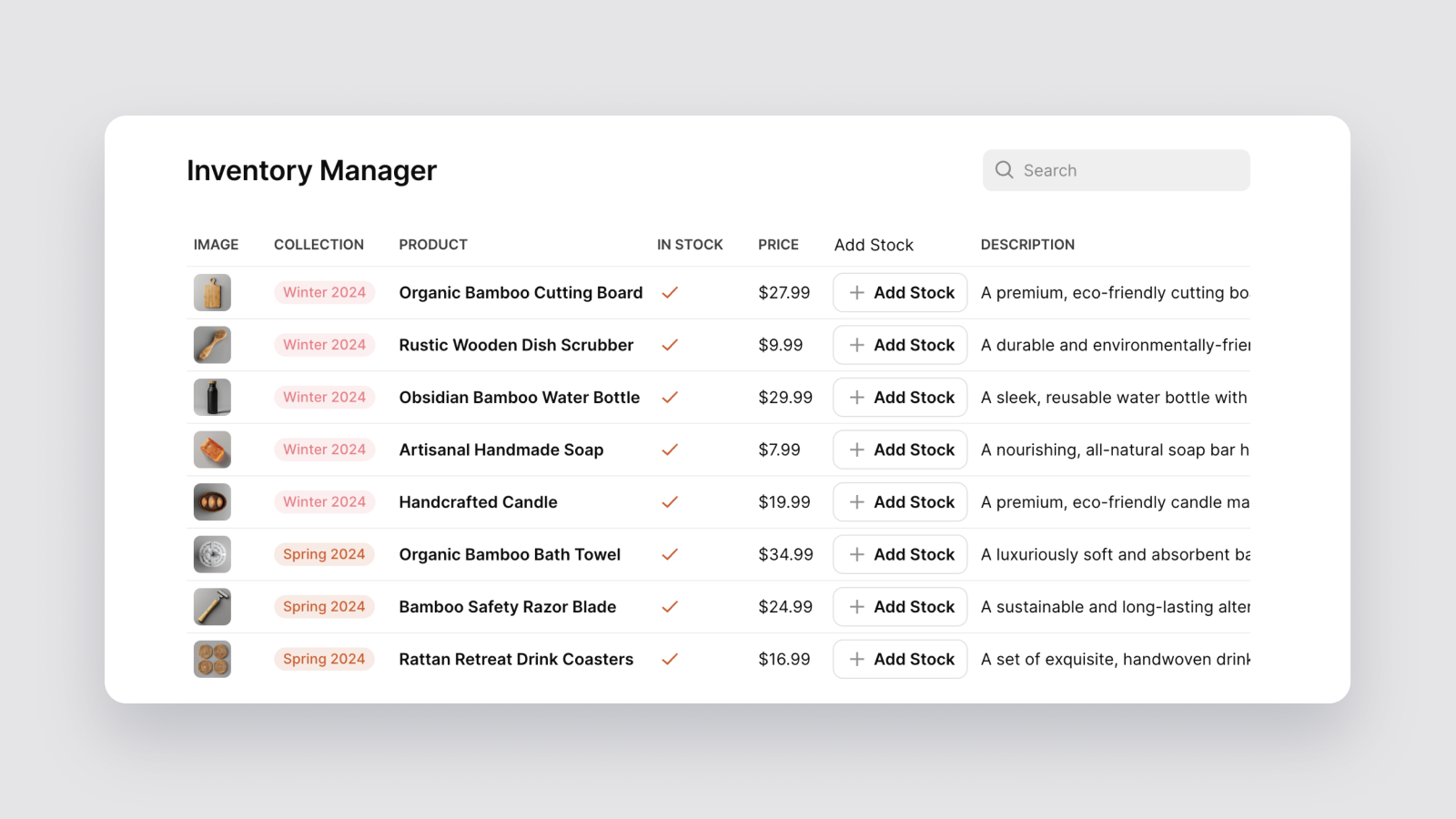
Our Table component has been revamped to provide more flexibility and customization options, allowing you to add dozens of columns to your tables and use new column types like Tags, Buttons, Choice, and Boolean. These improvements not only make it easier for users to view and interact with their data, but enable you to build more versatile apps for project management, inventory management, work orders, and beyond.
The Table component’s new column types include:
- Tags: Categorize your data with color-coded tags for easy organization and visual distinction.
- Buttons: Add clickable buttons that enable users to interact with your data and take immediate actions.
- Choice: Allow users to select from predefined options, ensuring simpler and more consistent data input.
- Boolean: Include boolean toggles that allow users to easily capture true/false values.
- Link: Turn text into clickable links, enabling users to quickly access related resources and external pages.
- Image: Display images inline to enhance your table's visual appeal and provide additional context.
As mentioned above, the new Table component is particularly useful for project management and issue-tracking apps. For example, tags can be used to categorize tasks by priority or status, buttons can enable quick actions like sending notifications or triggering workflows, and boolean columns can indicate task completion or issue resolution.
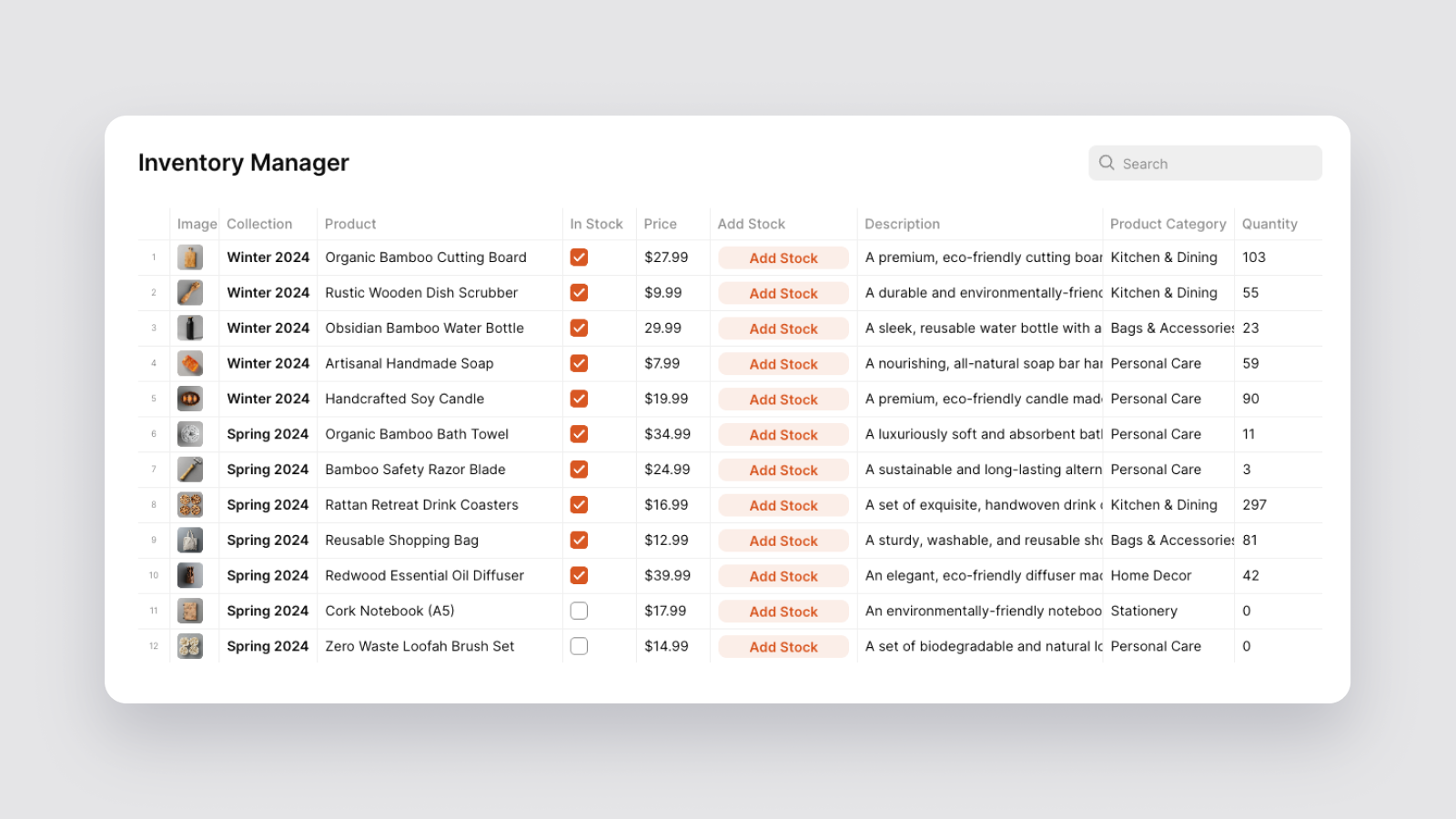
As part of this change, we’ve also upgraded our Data Grid component to provide a more spreadsheet-like experience for users who require a denser, edit-first interface. The main difference between the updated Table and Data Grid components is that the Data Grid is designed for more intensive data manipulation and entry, while the Table component prioritizes viewing and interactivity.
Build More Versatile Apps With Glide
Our newly redesigned Table component empowers you to develop a wider range of applications that better fit your needs and user preferences. It’s just another example of how we’re committed to making Glide the most flexible platform for bringing your custom software to life–whether it’s a simple task tracker, a complex project management system, or anything else you need to be more efficient.


