Glide HomepageOpen Glide

Getting Started

Quickstart
Intro to Layout
Intro to the Data Editor
Data to Layout
Intro to Actions
Intro to Workflows
App Settings
Templates

Essentials

Data Sources
Basic Columns
Components
AI Custom
Action Row
Audio
Big Numbers
Breadcrumbs
Button
Charts
Checkbox and Switch
Choice
Collections
Contact Form
Container
Date Pickers
Entry
Fields
File and Image Pickers
Form Container
Hint
Image
Link
Location
Map
Notes
Progress Bar
Rating
Rich Text
Scanner
Separator
Signature
Spinner
Stopwatch
Tabs Container
Text
Title
Video
Voice Transcription
Web Embed
Security and User Data
Users
Publishing and Sharing

Automation

Actions
AI
Computed Columns
Integrations
Workflows
View API Docs

Use Cases

Forms
Images in Glide
Conditions, Filtering, and Visibility
Duplicating Apps

Reference

Account
User Experience
Values
  • Components
  • Checkbox and Switch

Checkbox and Switch

Change true-false values.

The Checkbox and Switch components allow you to toggle boolean values in your data source.
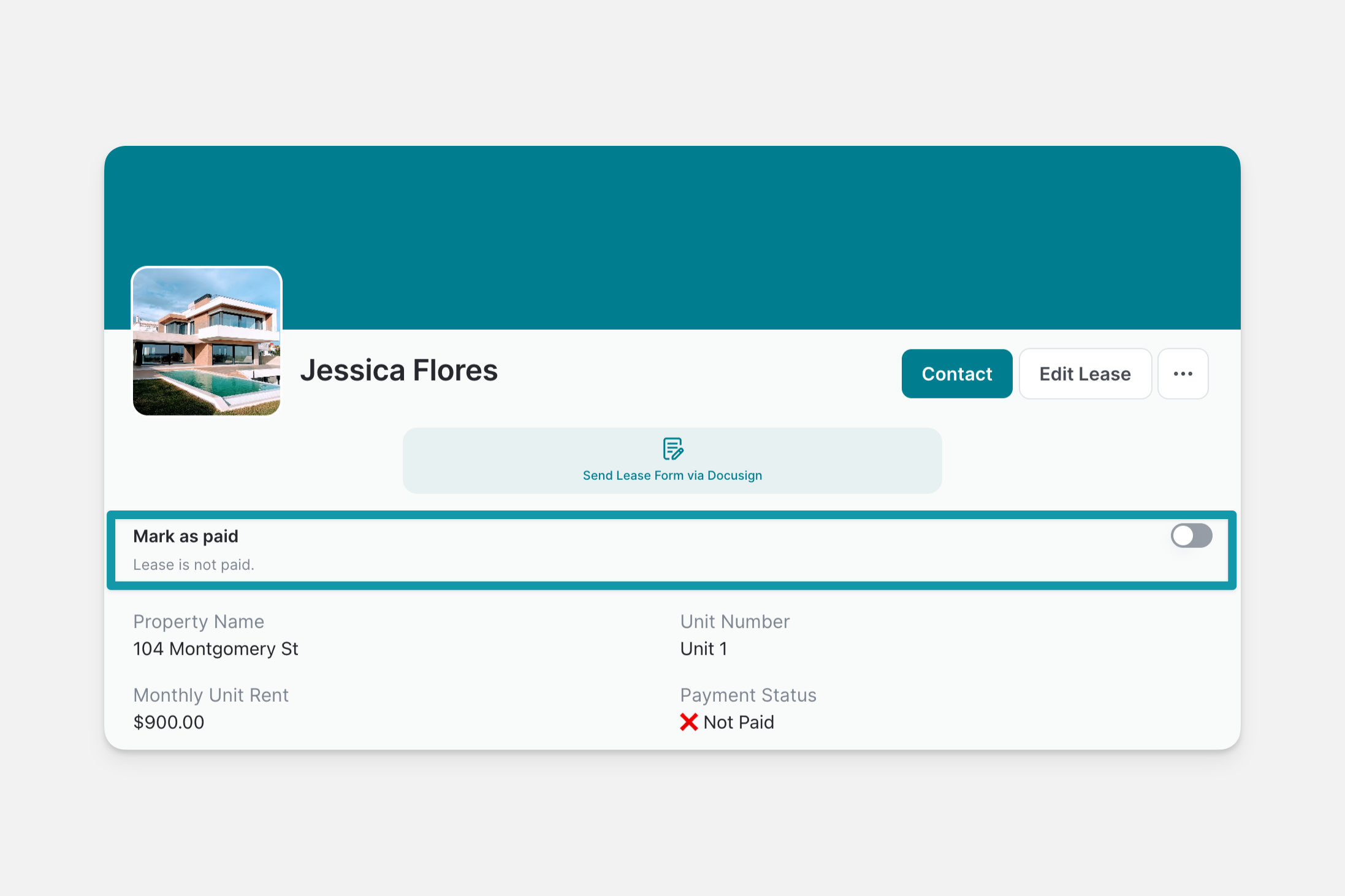
Use case of the Switch component.

Adding and Setting Up the Checkbox and Switch Components

  1. In the Layout Editor, select the tab you want to edit.

  2. Click on the plus (+) symbol in the Components panel.

  3. Select Checkbox or Switch.

  4. Select a column in your Data Source to write the value to.

  5. Use the Label and Description fields to let users know what the switch or checkbox is for.

If you like, you can change your component from Checkbox to Switch (and vice versa) in the configuration panel on the right side of the Layout Editor.

Have a question about Checkbox and Switch? Ask the Glide community.
Need more help? Hire an Expert.

Updated more than a week ago

Previous

Charts

Next

Choice

Was this article helpful?
Exit Preview Mode