Introduction
Google Analytics is the most common web analytics tool. But most people don't know that there's also a Google Sheets add-on. With this, we can import our analytics data directly into our sheet and display that data with our own custom Glide app.
Installing the add-on
First, we need to install the add on to Google Sheets. Before we create a report, we need to think about where we’ll eventually want to display this data. We have two options;
- Create and run our reports in the same spreadsheet as our app
- Or create a separate spreadsheet where we run our reports and import that data to our main app’s Spreadsheet. This is probably a better option if we’re going to be running many different reports – as each report needs its own sheet. We’ll go over how to do this later.
Create a Report
To create a report, we’ll go to the Add-ons menu, select Google Analytics, and Create New Report. Here we can name our report and select the account, property, and view we wish to import from.
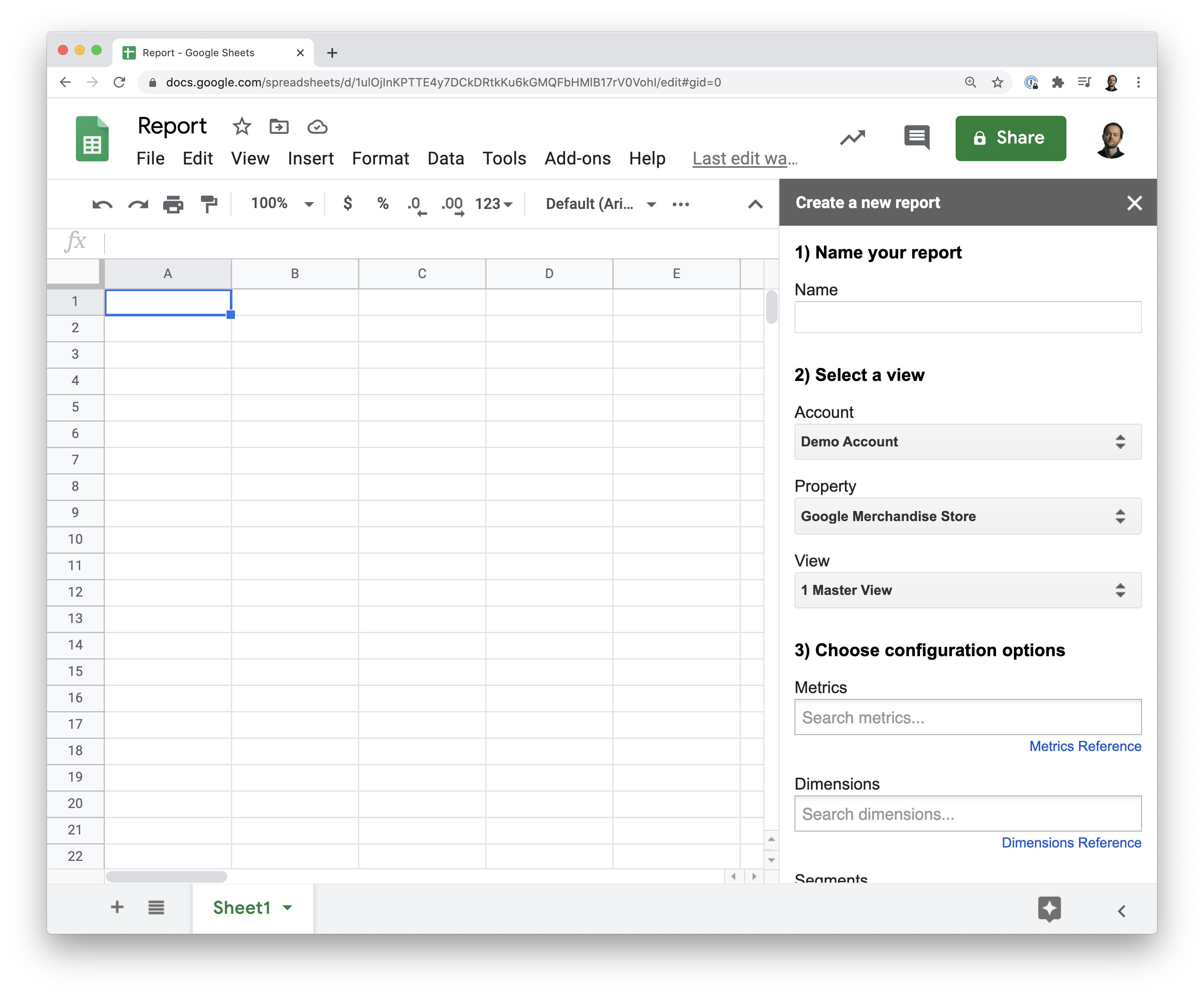
Next we need to configure our report. Below, we can see metrics, dimensions and segments. Metrics are the foundation of analytics, so let’s just focus on that for now.
Metrics
Metrics are quantitative – in other words, they are something that is countable, like the number of users or avg session duration. For simplicity, let’s just choose users as the metric and click run report.
The Google Analytics add-on will create our report configuration tab and add a new report column with the settings we chose.
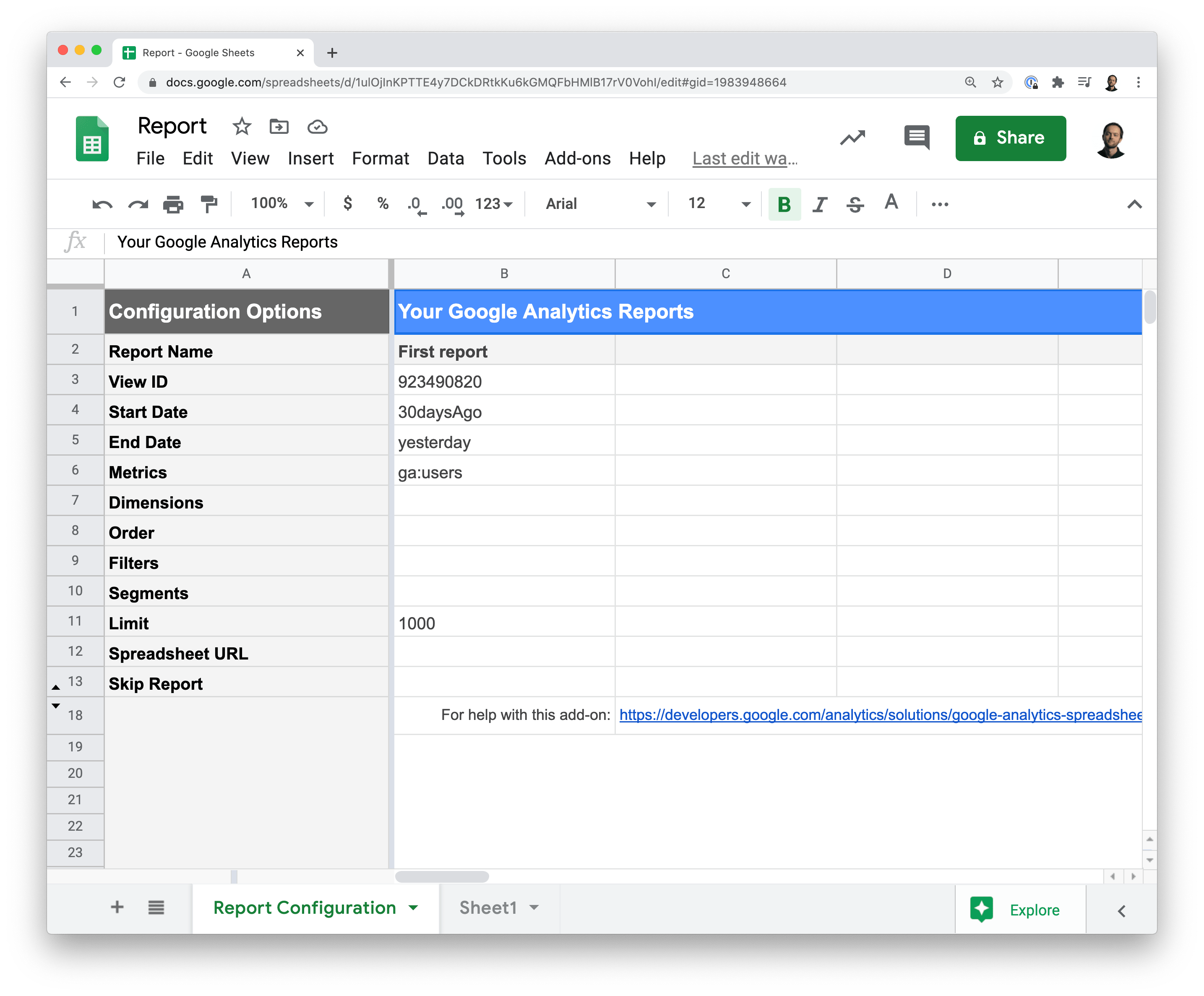
We can see here 👆🏼 that we have the;
- Report name
- The View ID which is the Google Analytics view we’re importing from
- We then have the start and end date for our report (this defaults to the last 30 days)
- The metric we chose
- And a default limit to prevent the tool from importing too many rows.
To run the report, head up to the add-ons menu and click Run Reports. When we do, it will show us our users for the last 30 days in a new sheet.
Dimensions
This is one of the most simple reports you can do with Google Analytics; one metric with a date range. But most of the time, reports need to look at dimensions, in addition to metrics – to narrow down what you're looking for.
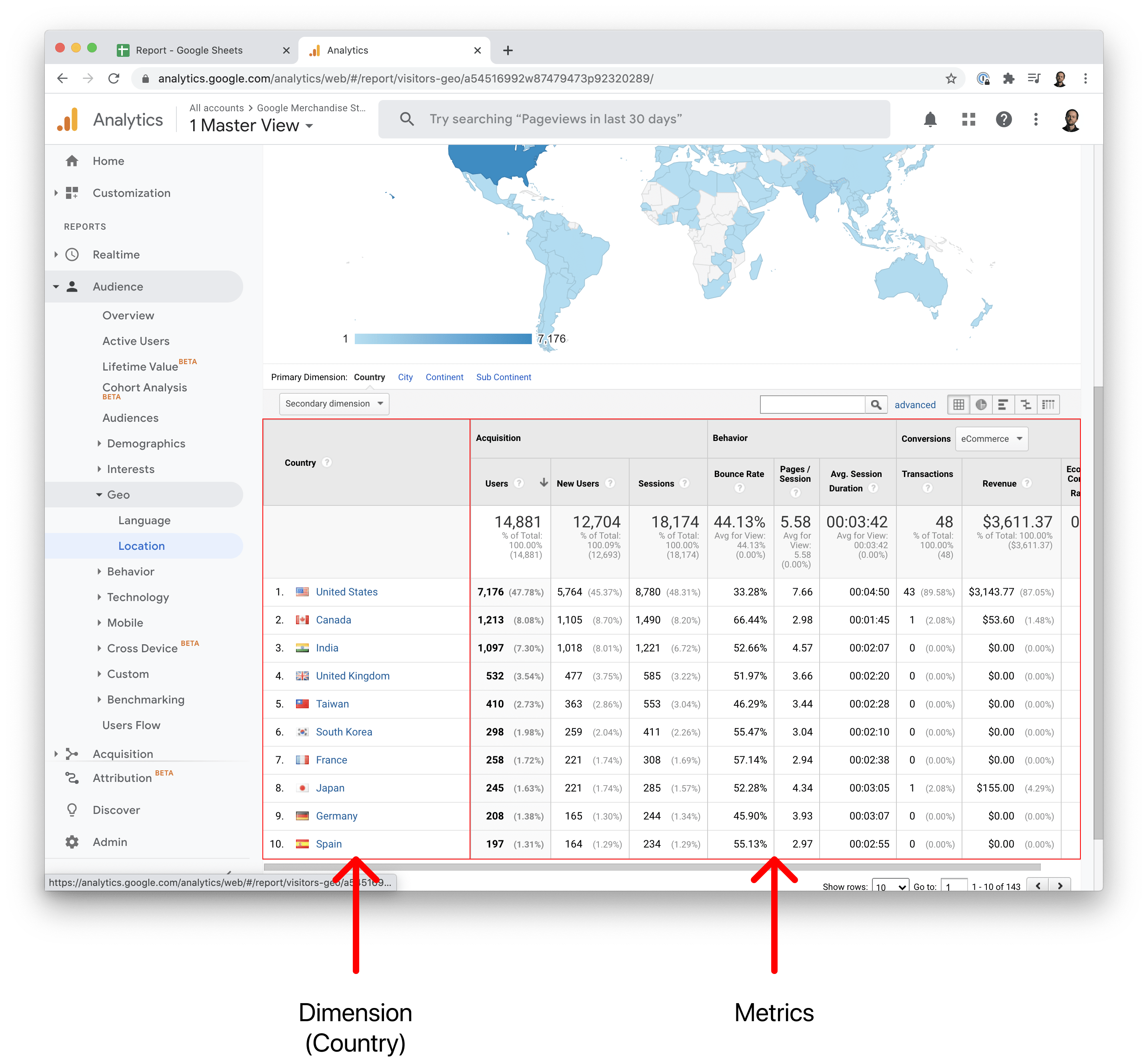
In contrast to Metrics, Dimensions are qualitative - in other words, they’re typically attributes that are not incrementable, like the user’s country or browser type.
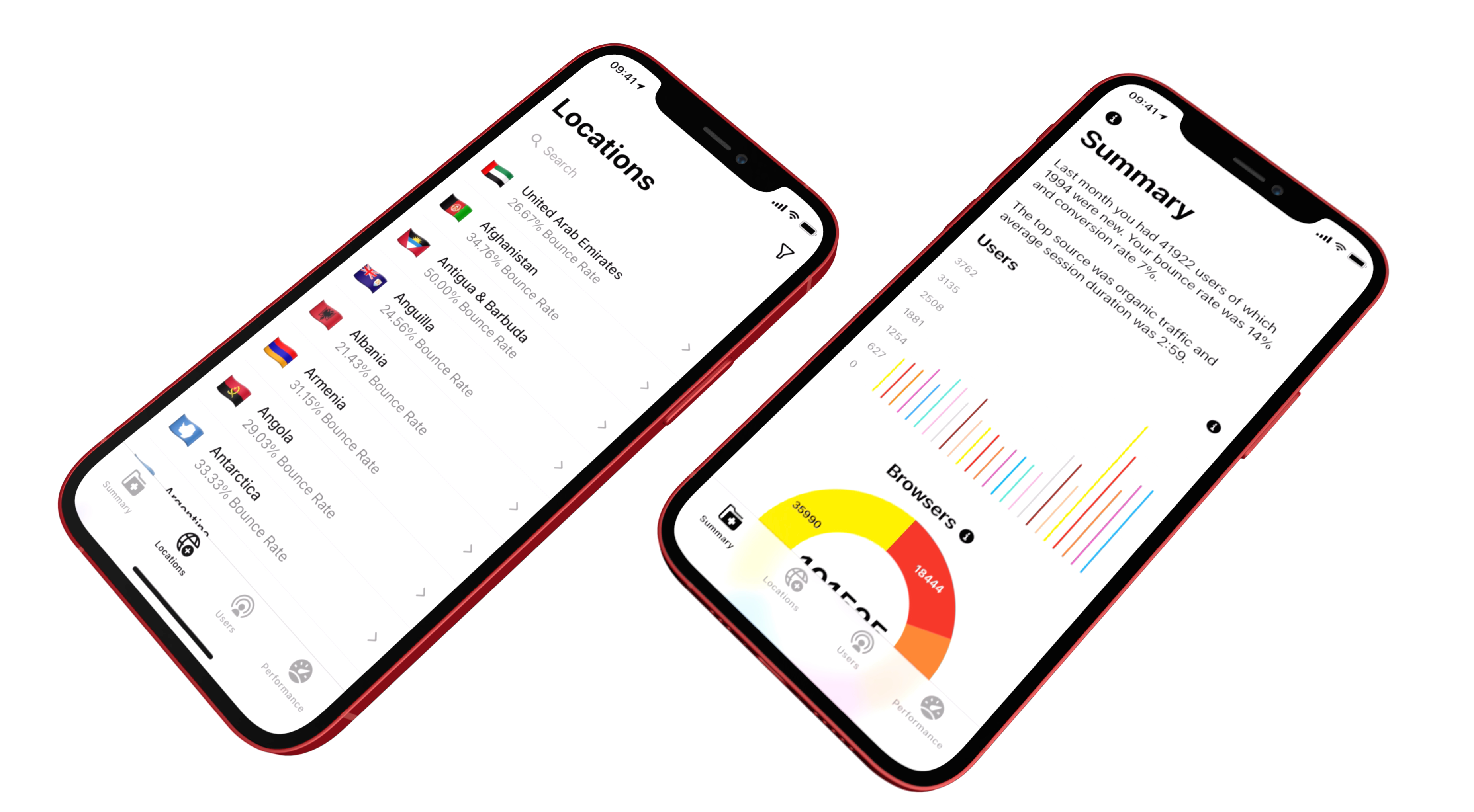
Google's Analytics' Location Report 👇 is an example of a report that uses dimensions & metrics
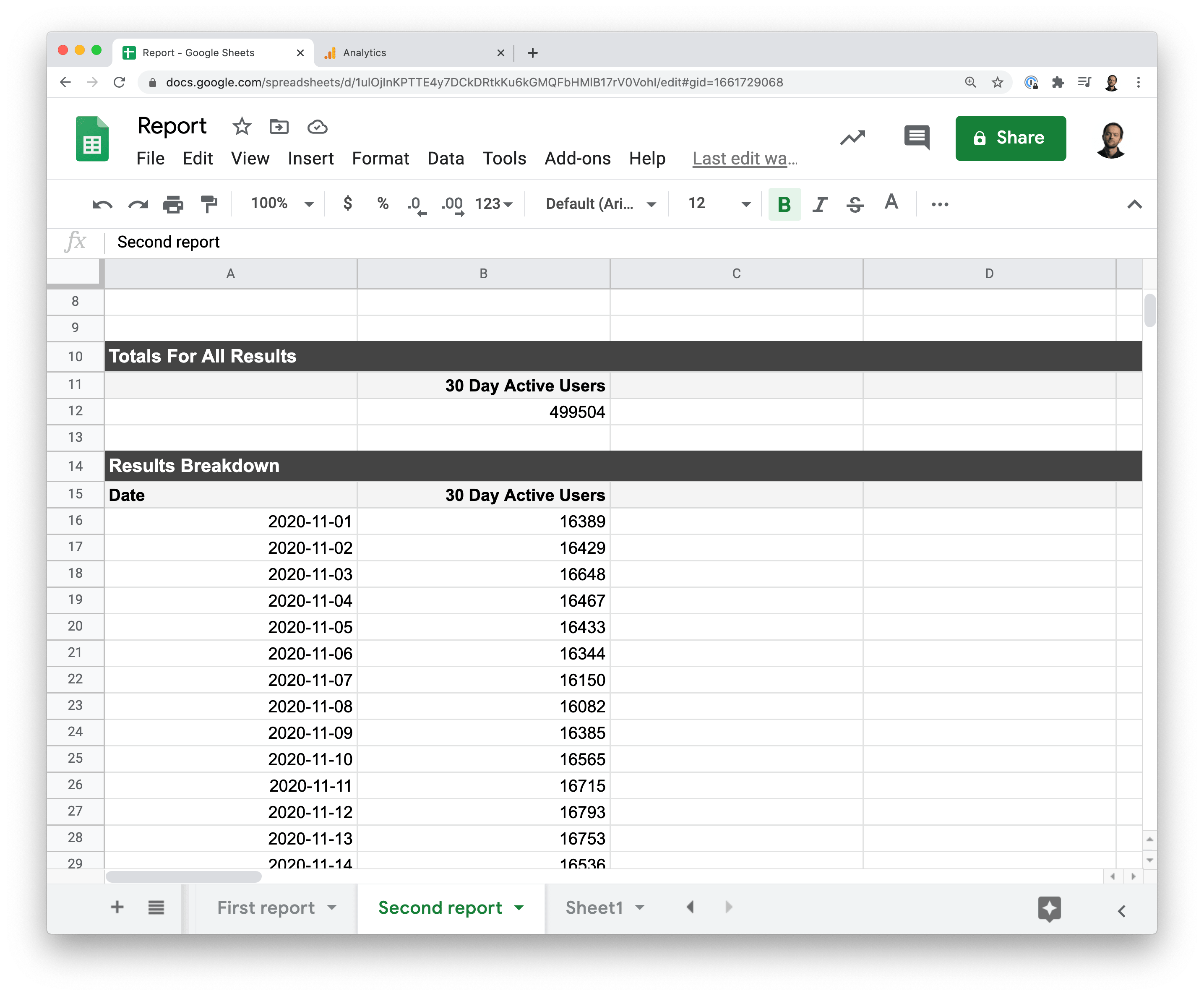
So, let’s create a second report which looks at monthly active users as the metric and date as the dimension.
Now we get a report that has multiple rows, one for each date over the last 30 days.
Formatting the data
To display data in a chart in Glide we need to have the range of data at the top of the sheet – with no empty rows above the header row.
Because the Google Analytics Add-on creates a summary at the top of every report – we need to transpose this data into a new sheet. Again, there are two options:
- If you're using a single spreadsheet, you can use ARRAYFORMULA to copy the range into a new sheet.
- If however, you have a separate Google Sheet for your reports, you can use IMPORTRANGE to do this. We have a separate video on how to use this function.
Displaying Data in a Chart
In Glide, we’ll generate an app from our GS and make sure we have an empty details screen. Next we’ll add a chart component and choose the bar chart.
- We'll add the Date dimension as the label
- and the MAU metric as the quantity
Now our chart shows MAU by date.
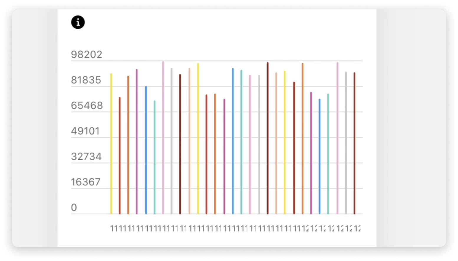
But the bars are kind-of thin - because we have 30 values we’re displaying. Let’s change our report settings to only show the last 15 days and run the report again – showing fewer bars and making the chart more legible.
This one small tweak you can make to the report – there are many other aspects to working with the addon that you can learn about here.
Scheduling
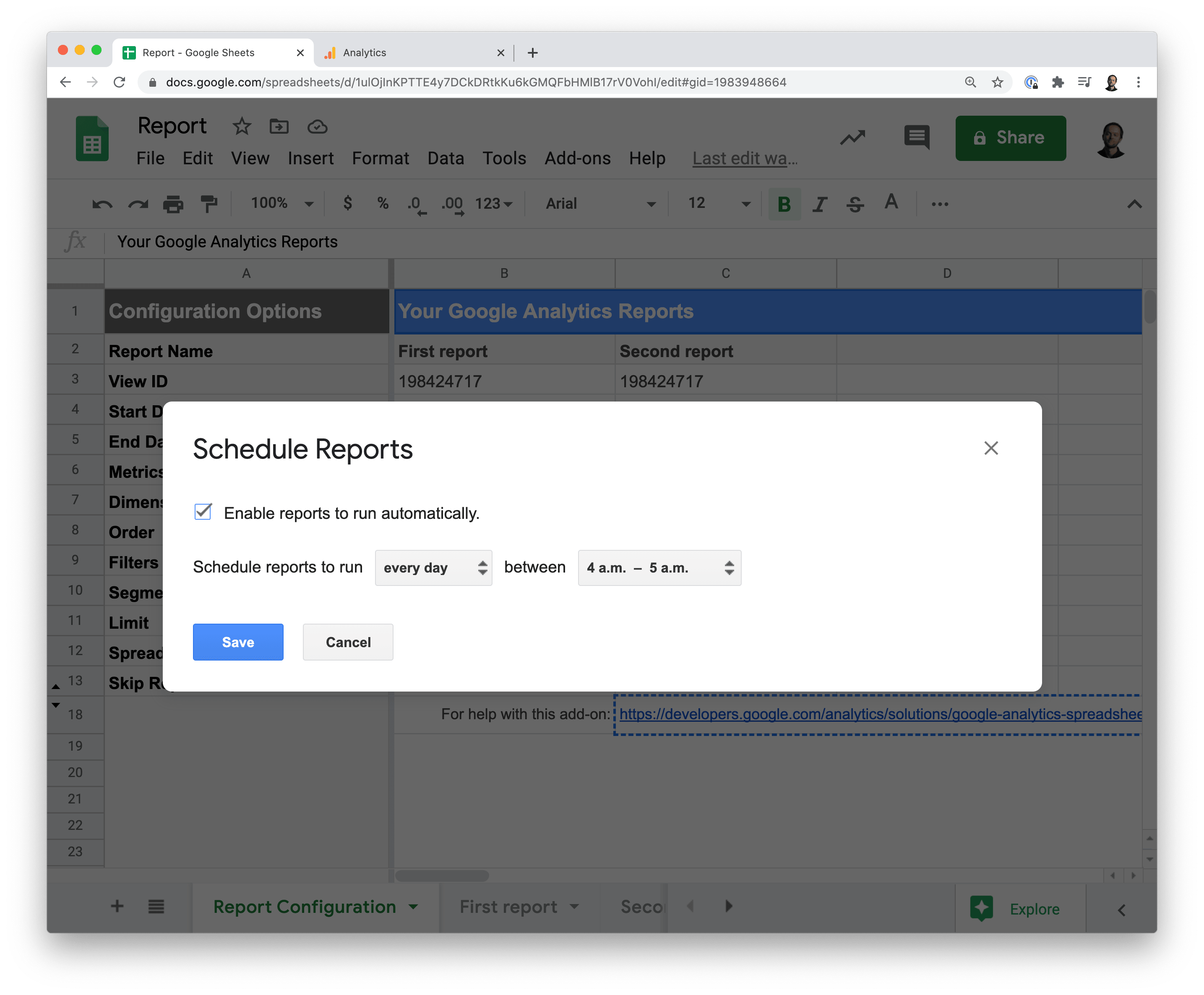
The last thing we need to do is schedule our report to run every night, so it always stays up to date.
We’ll head to the add-on and click on Schedule reports. Here we can schedule our report to run every day at a certain time. This works for all reports in your Google Sheet.
Summary
There are many other ways you might want to display your data. You could use list layouts, add filters and sorting. Dig deeper into each row on a details screen and there’s also the potential to use Glide’s Math and Template columns to format your data further.
Although we’ve made one chart, you now have the essentials of how tocreate and run reports in google sets for your own custom glide app


