


Introduction
Glide is a no-code tool for building custom mobile and web applications based on spreadsheet-like programming model.
You provide your own data, choose how to render it using a set of high-fidelity components, and get to a working application in minutes. Glide is used for everything from building employee directories, through inventory managers, restaurant applications, to feedback forms and issue trackers.
This incredible convenience comes at a cost, of course. If you need something outside the set of pre-made components, you're pretty much out of luck — at least today.
This blog post documents a research project allowing end-users to build custom reusable Glide components.
Glide's Limitations
To provide some context for this research, let's start with a quick overview of Glide and its limitations. If you're already familiar with the platform, feel free to skip to the protoype section below.
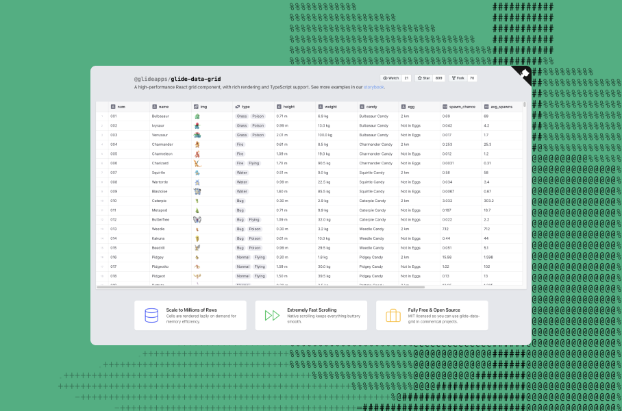
Glide allows you to quickly build web and mobile applications on top of tabular data. The screenshot below shows the main application interface:
- a layout tree with selected UI component on the left
- interactive application preview in the middle
- properties for the selected UI component on the right
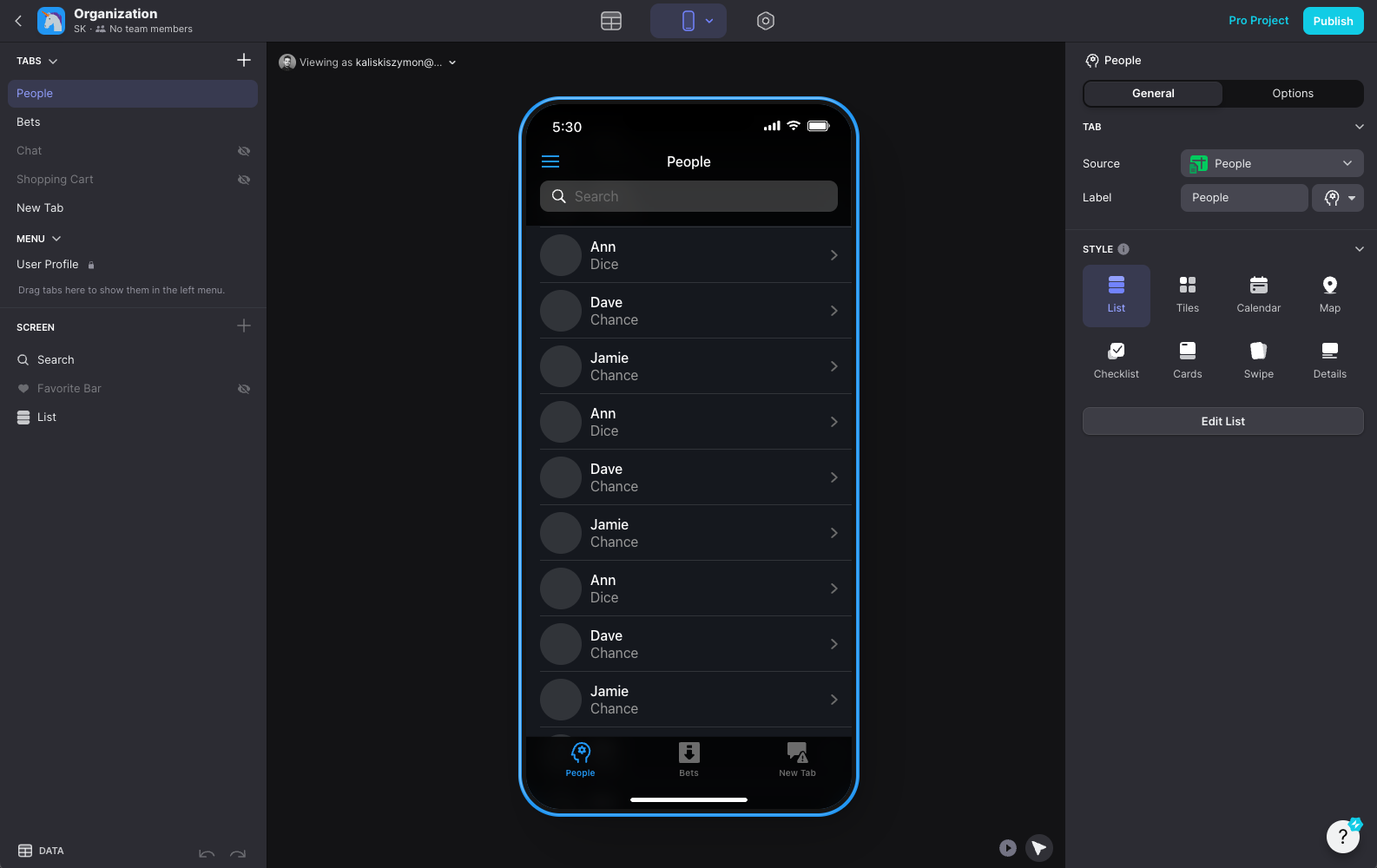
In Glide, you build the UI by adding components to the layout tree, binding them to the data in a table, and adjusting their properties. Glide provides a set of high-fidelity components covering everything from text labels, through buttons, images, charts, maps, and collection views with multiple rendering styles.
The selection of available components provided by Glide follows the 80/20 rule. They are chosen to be useful to the largest subset of customers, and if your needs fall outside of that range, there's not much you can do.
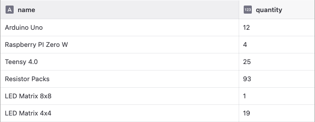
For example, imagine you are working on an application for tracking stock in your warehouse, and wanting to display a list of items including their quantity, and a button to add or remove items from the shelf, like so:
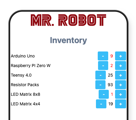
In Glide, there's no pre-made collection view that renders exactly this way, and you can't modify how a row is rendered in that list either. Even if that was possible, there just isn't a two-buttons-side-by-side-with-a-text-between-them component available that you could use.
At the same time, we can't expect Glide to provide a specific component like the one described above, since it's so idosyncratic to this specific use-case.
In this research project we set out to explore a way to allow end-users to build the custom components they need, while preserving as much as possible of Glide as it exists today.
Prototype Walkthrough
To introduce the prototype, we're going to build a mobile application for tracking stock in a small electronics shop warehouse:
We can build the application interface using a familiar layout tree builder. Let's grab a Company Logo, and a Big Header first:
The Company Logo is a custom component that we got the code for from the Glide forum. We're going to look at it later, as we'll want to swap the logo to a newly designed one. But first, let's change the header text using a property pane:
Next, let's display our data table. For this, we're going to use a Collection component:
Notice how the Collection has an empty space where we can + Add child. Nesting in the layout tree allows us to pass components around, as inputs to other components. Additionally, nesting inside the Collection is special, as it renders the child component for each row of the data table:
We want to not only see the items in our inventory, but also change their quantities through the application:
Everything that we do is immediately usable in the application preview, and updates the data table:
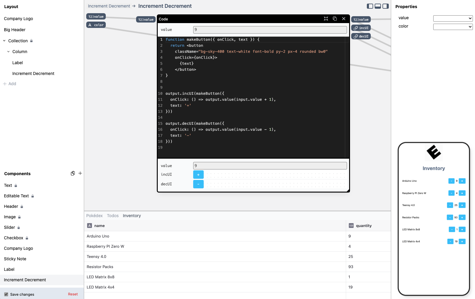
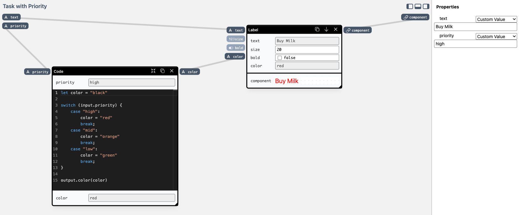
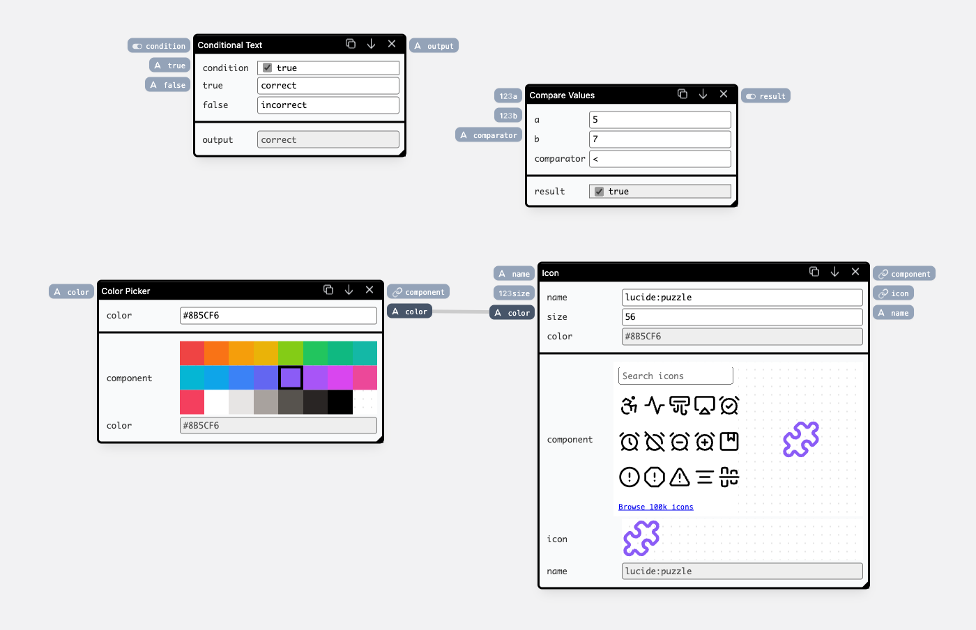
With a lot of inventory, it might be easy to miss the stock going below a certain threshold. We can improve on that, by highlighting values going below 10. To achieve this, we're going to modify the Number Picker component definition by opening the component editor view:
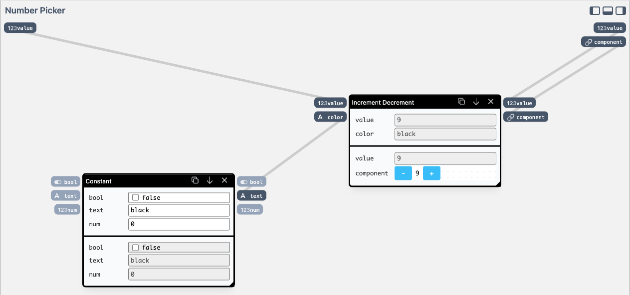
Number Picker component definition in the component editor.Top-left ports are inputs to the component, and top-right ones are the outputs.
The Number Picker is defined in terms of a more general Increment Decrement component, by encapsulating it, and providing a constant color value using a Constant component. We're going to keep on using the Increment Decrement component, but make the color dynamic inside of our Number Picker.
We have a bunch of components available in our library — we can use Compare Values to calculate the less-than-ten condition, and Conditional Text to return "red" or "black" based on the comparison.
First, let's add Conditional Text and test the color changing:
component output of the Increment Decrement component on the right.Now instead of controlling condition manually, let's wire it up to a Compare Values node:
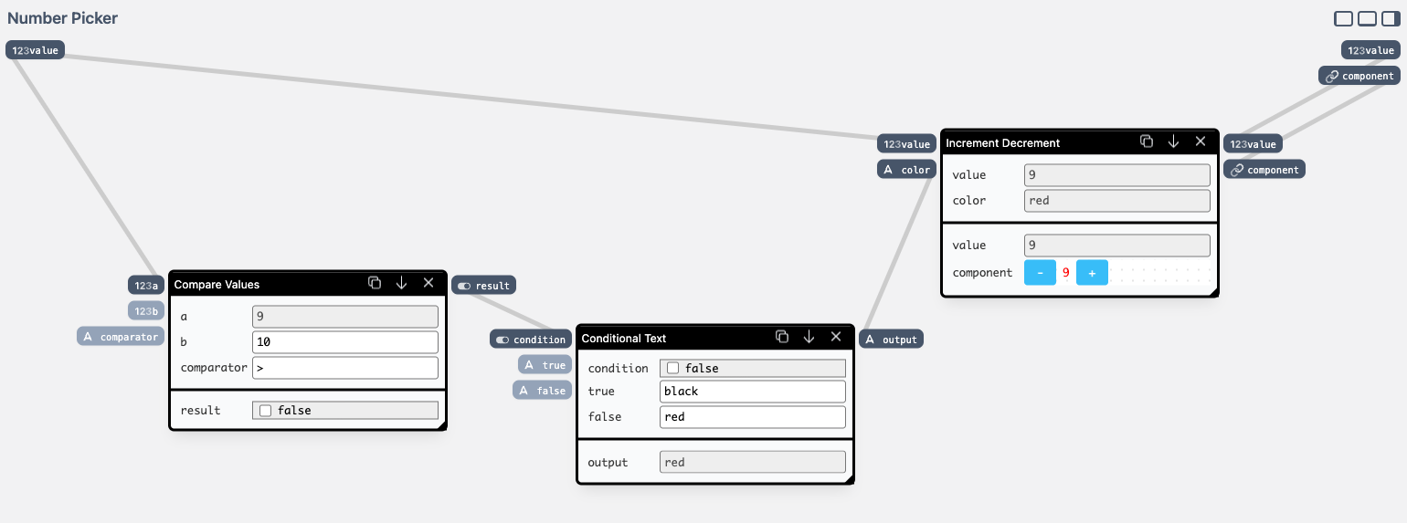
As the result, in our preview, we can now easily see which items in our inventory we should order soon:
Finally, we'll swap the old logo for a new design. We have the Company Logo component that we found on the Glide forum:
There's more to this prototype than meets the eye, so continue reading if you're curious, as we dive into more technical details: the mechanics of composability and re-use, combining the reactive data-flow with data table updates, and details of editing custom components.
If you want to play around, the live version of the prototype is available online — keep in mind that this has a research quality, and can easily break. If you get yourself in trouble, hit the Reset button in the lower-left corner.
Project Goals
We set out with a main question in mind: how could we enable building and re-using custom components, in a way that caters to both non-technical, and technical users?
It's easy to imagine both ends of this spectrum: on the non-technical users side we have Glide as it is today (ignoring a few advanced features like custom CSS or code columns), on the far end of the technical spectrum we have: JavaScript, web frameworks, databases, servers, and hosting — all of which a potential power-user would have to know to build a fully custom solution. We believe that there's a space for a tool that accommodates both non-technical users, and non-developer power-users, and that doesn't require a full developer environment to get things done.
Design Principles
It's impossible not to mention spreadsheets at this point. They are the most commonly used end-user programming systems, and have multiple useful qualities that we took inspiration from. Mainly:
You shouldn't have to know everything to do anything
As Bonnie Nardi writes in “A Small Matter of Programming”:
The prototype provides a smooth on-ramp of complexity:after a small investment of time, the beginning spreadsheet user has a functioning program of real use (...) Users do not have to learn every feature of a programming system (...) but they must be able to get some real work done
- We don't even have to open a component editor to get to a working outcome — applications can be assembled by combining existing components through the layout tree and property picker alone.
- The second step is modifying already existing components using visual nodes. The prototype provides a selection of logic and interface builders for assembling functionalities that are not available out-of-the-box in ready-made components.
- The last step is going down to low-level implementations of these components written in JavaScript.
Importantly, the proposed solution is useful even if the user never takes the step from 1 to 2 — building useful applications can be done through the combination of data tables and high-fidelity components: this is what Glide is today.
Different amounts of code are useful at different complexity levels
Spreadsheets are useful even if the user never writes a single formula. The spatial grid can be used for laying out information, and for some use-cases this is enough of a useful functionality to get out of the system. Introducing formulas allows for adding calculations, and combined with reactivity produces an incredible programming system. Developers can write VBA (with Excel) or Javascript (for Google Sheets) to add custom functionalities on top of the spreadsheet interface.
Similarly, we wanted to create space for different types of users, again after Bonnie Nardi:
- End users have little or no programming education and tend not to like computers strictly for their own sake
- Local developers are domain experts who happen to have an intrinsic interest in computers
- Programmers are professionally trained
Copy-and-modify is a great mechanism for re-use
We also took inspiration from how end-user programmers tend to use programming systems. In “Reuse in the world of end user programmers” Christopher Scaffidi and Mary Shaw write:
We built this prototype around the idea of duplication being the most common activity. Instead of starting from scratch, users assemble ready-made parts, and if these are not enough, they duplicate one that's close enough, and modify it to fit their needs.When programming, end users typically create programs that are specialized to the specific task at hand. When later faced with a similar (but not identical) task, people can sometimes reuse an existing program as a starting point, though doing so will typically require making some edits. For example, one study (…) found that “in many cases, a user initially created a script with a hard-coded value and then went back and generalized the script to reference the Personal Database [a parameter]”
Live systems allow end-users to offload "simulating the computer" to the machine
Finally, there are important properties of Glide as it exists today, that we wanted to keep around in this prototype: liveliness and working with real, visible, data.
Liveliness allows users to modify the layout tree or the component definition and see the result immediately in the previe — there's no code-compile-run feedback loop.
In Glide, the users also always work with real data. This is incredibly important — there's no need to imagine how something would look like for a specific input value. Instead, the user can just modify the property binding or a cell in the data table, and see the results immediately.
Non-Goals
It's impossible to tackle everything in a single research prototype. We wanted to remain focused on the main question of re-usability and composability at different levels of abstraction, and decided to keep some things explicitly out of the scope for this project.
We're using a visual node & wires metaphor for the component editor. There are a lot of interesting UI and UX questions around the usability of this approach, but we decided to implement only the most naive version of the interface.
While we built the prototype around the idea of creating a space for local developers we kept the implementation single-player. We believe that sharing is an important part of the direction prototyped in this research, but requires its own focused thinking and prototyping.
Inspirations
A generic UI-builder has been a topic of a lot of research projects, it is in some sense a holy grail of end-user programming research — a tool that a non-developer could pick up and build whatever application is needed at the moment.
Luckily, what we were after in this research project was more scoped down — we wanted to keep the Glide systemic aesthetic, target the same use-cases that Glide already caters to well, and just open the system a little bit more.
Nevertheless, we took inspiration from a lot of prior-art research in this area. Some notable projects include:
Finally, the core idea of node & wires interfaces for programming is still actively explored in projects like:
While these projects involve mixing low-level code-based nodes with high-level data-flow wiring, they have a different target audience compared to this prototype, and as a result, different mechanics and affordances. Most importantly, all of these tools lack mechanics for encapsulation of the higher-level nodes, which makes it impossible to build up on the components without writing code. Additionally, none of these projects are focused on building UIs, and while making one is still possible, it just feels against the grain of the tool.
The Prototype
We're going to take a closer look at the prototype now, and explore in more details how each of its parts works, and fits with the other ones.
Layout and nesting
Let's start by re-visiting the layout tree.
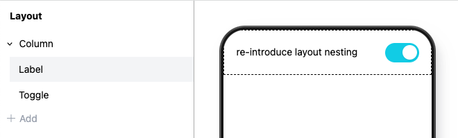
The most important question is: where does the nesting actually come from?
Let's look at how the Column component is implemented:
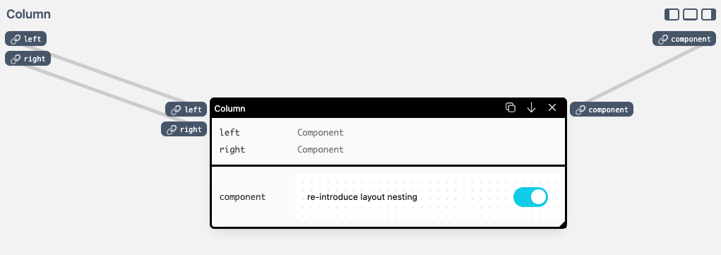
Notice how on the left side of the Column definition there are two input ports named left and right. In this prototype, we have a very loose typing, and we make use of the component type extensively.
The component type passes around fragments of the user interface — in the prototype, it's React elements, but that's for the most part just an implementation detail. Importantly, we treat an interface fragment as a ”plain value”, that can be easily passed around just like numbers or strings.
When we detect a top-level component-typed input, the layout tree creates empty slots for components to be nested. These components then flow through the graph, just as if they were wired together.
For example, this layout tree nesting:
Label component nested in a Card using a layout tree on the left.Is equivalent to this component editor wiring:
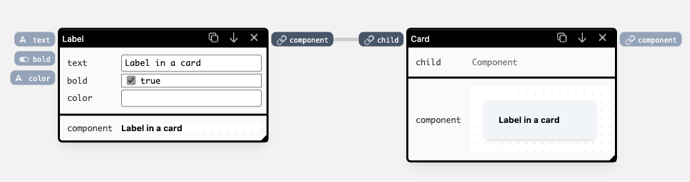
Label component passed as an argument to a Card through a wire.Above we saw how component inputs can be used both in the component editor (through wiring), and in the layout tree (through nesting). The last important thing about the layout tree is its output — creating the final application UI from a set of nested components. These components can return more than one UI element, so as a convention, the layout tree uses an output named "component" from its children, to render the final application.
Component properties
Component inputs, which are not component-typed, are configurable through a property pane. This is where they can be set to a custom value, or bound to a table column. Additionally, inside a Collection, these values change with each of the rows.
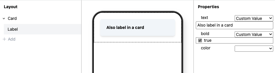
With this, we can define static properties of a Header:
And create a list of items from a data table:
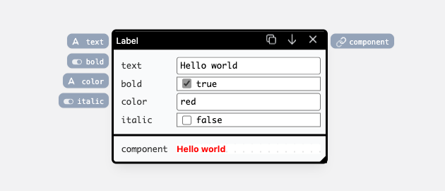
Some components not only display data, but can also edit it. This behavior happens when a component has an input and an output of the same name and type. Let's look at a Toggle component to make this bit more concrete:
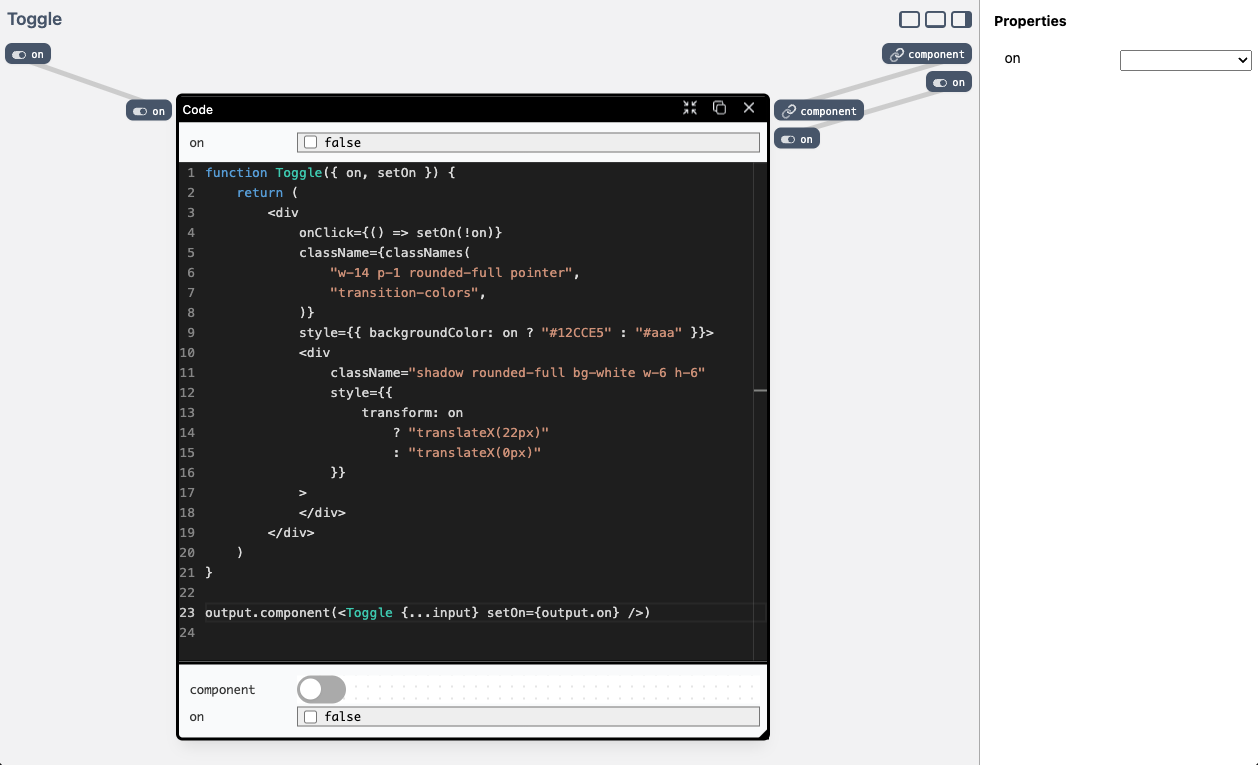
Toggle component made up of a single Code node.There's a lot going on in there. The main thing to notice is how there is both a top-level input and output port named on. We can bind this property to a custom value, or a data table row and through that “loop” update the connected values:
Component editor
Ports
We already looked briefly at top-level component definition inputs and outputs. Based on their types, these either create nesting in a layout tree, return interface fragments to be rendered in the app, or allow for properties to be bound through property panes. Each node on the canvas can also have multiple input and output ports.
These ports can be created on code nodes, and as top-level component inputs and outputs:
italic input port and connecting to a code node.The component top-level inputs and outputs can be wired, when the component is used as a node in the component editor. For example if we use the Label component defined above on the canvas, we would see its top-level input and output ports:
There are two additional things about ports in the component editor:
- They display live, editable values
Every input renders a picker related to the type of the input port. If the input is not wired, the values can be edited directly on the canvas, and are stored with the definition. If the port is wired, the input acts as a preview:
- They are easily accessbile in code
All components, at some point, terminate at a code editor:
The code editor can hold arbitrary snippets of JavaScript: from simple logical operations, to multiple functions and multiple React element definitions.
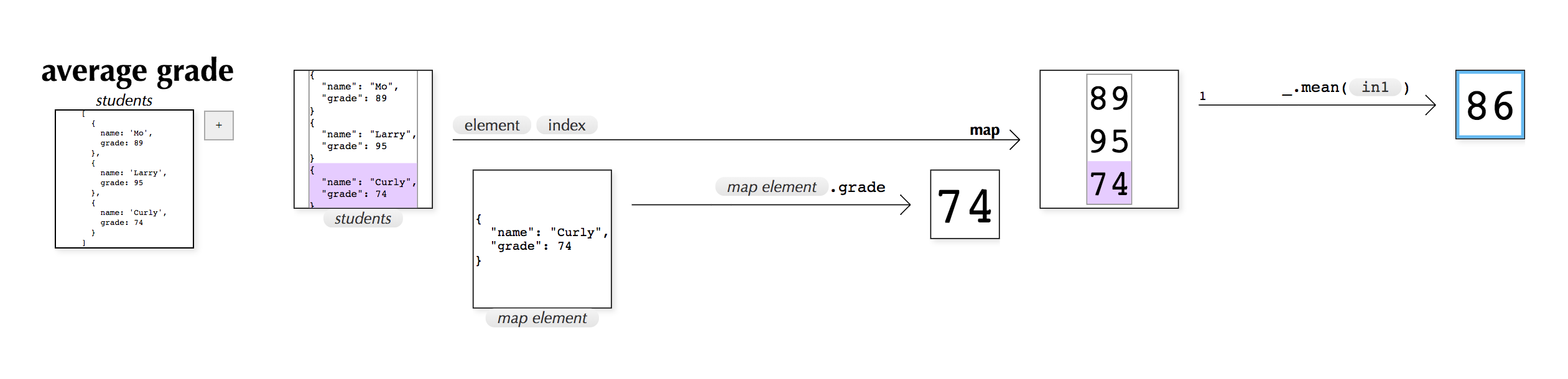
To support multiple inputs and outputs on a node, there are two global variables in scope:
inputwhich is an object containing an input value for a specific name: acolorinput with a value"red"is available in the code block asinput.colorand equals the value"red". With any change on any input port, the whole code block gets called again, with newinputvalues.outputis an object containing functions for every output port, which should be called to update the output value. If we want to change thecoloroutput port value to"green"we would calloutput.color("green"). This call starts a value propagation process, flowing through the connected wires to other nodes.
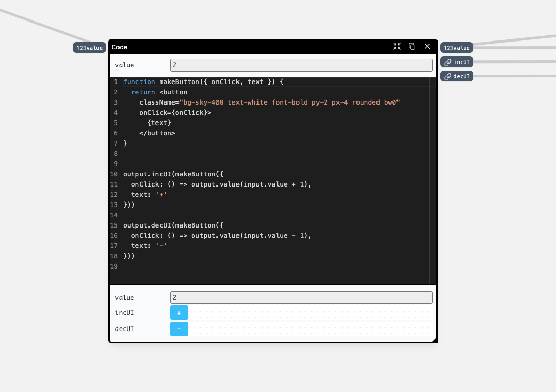
Having multiple outputs allows us to build components which return multiple React elements, each of them returning value updates:
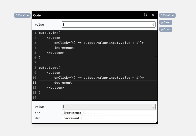
Notice how we return two React elements: one for incrementing, and one for decrementing the value — and how both of them read and write to the
valueports.We can use another code block to combine them into a single UI component, and test them in the different contexts:
Recalculation loop
There's one more thing to ports, that you might have already noticed: the same way that we loop around properties if the input and an output have the same name, we loop around nodes for inputs and outputs of the same name. Let's visualize this with a bit of an unusual example:
We have an input and an output port named text and this causes the node to be internally wired. Any change to an input causes the change to the output, and with any change to the output. the node is re-evaluated with new input values.
This allows us to easily build things like a stateful checkbox:
But, this approach can also lead to infinite loops, when a new output value triggers node recalculation, which triggers a new output value again:
The tradeoff here is convenience: using the matching-name convention makes building UI-driven nodes more ergonomic, but can cause issues like the one shown above. Removing this behavior introduces a need for state boxes, and wrapping the wires around them:
Nesting components
The component definitions can be nested in each other, which enables building functional visual nodes, and re-using them in other component definitions.
We've already seen this, when we took the first look at the prototype — we modified the number picker to change color using Conditional Text component:
The Conditional Text node has an arrow pointing down — we can use it to jump from the instance of that component to its definition:
Notice how we can use the breadcrumbs visible in the upper left corner, to quickly jump back to where we came from, and how the values are visible even in a deeply nested component — the true input is set to "red" and the false input to "green" — the execution context of where this node is originally used is retained.
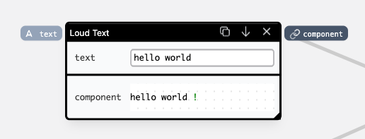
Components are embedded as references, which allows us to modify the implementation of one of them, and these changes are propagated to everywhere it's referenced. Let's look at a simple example below — we're using two Loud Text components, which add exclamation marks at the end of the input text. If we modify one of them, the other one stays in sync, with the values being persisted where possible:
If we want to have two separate implementations, we can duplicate an already existing one into a copy, and modify from there, while keeping the original intact:
There's no way to do this from a node & wire editor workspace, but it's easy to imagine adding the same duplication button to the top bar of a node instance:
Finally, it's worth noting that code and visual nodes can occupy the same space, and pass values to each other:
Which style is used often boils down to preference and familiarity. The same logic could be expressed using a couple of Conditional Text nodes, or by making a new custom Map node that could hold and query key-value pairs. This freedom has its disadvantages, though — there's no one correct way to achieve some functionality, which could possibly impact how easy it is to learn the system.
Findings
A proper membrane is important for assembling at different levels of functionality
This prototype mixes textual code with visual nodes and high-level re-use through a layout tree. Each level builds up on the one below, but uses different interfaces to building functionality. This is the opposite end of the spectrum to a system where everything is created through the same primitives: Lisp S-expressions are a good example here.
The proposed approach requires careful thinking about how different layers communicate, and co-exist with each other.
Importantly, code nodes and interface-driven nodes can occupy the same space, and talk to each other without much ceremony (other than wiring inputs and outputs). This creates a space where different approaches to building functionalities can be mixed & matched based on the task at hand, and the user's familiarity with a specific way of achieving their goals.
Liveness and real data provide visibility into the living system
In this prototype, each change that we make immediately recomputes and refreshes, propagating the updates up to the application preview. Additionally, each input and output of a node contains a preview of the current value — and interface fragments can be interacted with regardless of where they are:
All of these combined provide a sense of liveness — the tool can always be interacted with, wiggled to see the values update, and the need to simulate a computer in your head is often replaced with plain seeing.
Clear data-flow semantics are crucial for node & wire systems
In this prototype, we put a lot of effort into having clear directionality to how updates flow through the system. The graph introduces left-to-right semantics, with inputs on one side, and outputs on the other. The nodes are evaluated based on the data flow from outputs to inputs, and not on their x/y position or an order of creation. The values always propagate from an output to another input, and the wires can be conceptualized as pipes through which this data flows. Interface fragments are also treated as data in this prototype, which allowed us to use the same conceptual framework for passing UI around.
This approach can be contrasted with treating wires as references, which makes it possible to pass a callback function around, which leads to spooky action at a distance — it's easy to introduce complex invisible relations between functions, by calling up from a referenced callback somewhere deep in the stack of components. Avoiding this by explicitly designing against it promotes clear evaluation semantics in the system.
Open questions
How much of a type system is necessary for a useful programming system?
In this prototype, we built just enough of a duck-typed type system that we could get the functionality we care about. The inputs and outputs can only pass plain values (assuming the UI component is a ”plain value”), there's no support for homogenous or heterogeneous arrays, or objects containing key-value pairs.
While it's easy to imagine naively extending the type system by adding support for arrays of specific types, this introduces additional UI and UX complexities.
We discussed implementing PANE-like iteration node:
But we simply ran out of time.
How to work with collections in user-space?
One of the most important building blocks of the prototype is the Collection component. It's available only in the layout tree, and allows for mapping over a data table, and spawning components for each of the rows.
On a first look, this might seem like a simple thing to move into user-space: “it's just a .map over the connected data table!”
Unfortunately, things aren't that simple: from the decision that wires contain only plain values, and that a fragment of an interface is a plain value comes the problem of connecting the function which we'd use to map over the collection. Notice how outputs of nodes are React elements, not functions that return React elements — and this makes it impossible to re-bind their inputs to different values, which would be necessary to iterate over each of the collection items and display their values.
How much of the underlying platform can we ignore?
This prototype is built on top of web technologies, but mostly ignores their idiosyncrasies, for the sake of conceptual simplicity. This becomes apparent when thinking about complex use-cases, like building an input field that upper-cases whatever is typed, and preserves the cursor position. This requires capturing the browser event, and storing and restoring the cursor position during re-renders.
Currently, there's no support for any of this in the prototype, we assume that outputs of components are plain values, and a browser event isn't one of them. Figuring out a way to solve this issue in a way that meshes well with the system remains an open question.
Is a single bucket of components actually useful?
In this prototype, the exact same components can be re-used for assembling the final application through the layout tree, and for building more complex components by embedding them in each other in the component editor. This possess some conceptual sense of beauty, but at the same time we've built a lot of components that work only when used as graph nodes:
One obvious solution would be to create different tags for the components, so some of them are only visible in the layout tree dropdown, and some of them only in the component editor.
This is a part of a bigger problem of finding and selecting relevant components, which might become even more problematic if we add sharing to the system. It's easy to imagine getting lost in hundreds of slightly different Label implementations, and we're not sure if this is solvable with just UI work.
Conclusions
With this research, we set out to find a set of primitives for creating custom components in a possible future version of Glide. We ended up with a programming system that is live, deals with real data, and allows users at various level of technical skill to build progressively more involved functionalities. Each level of assembling components gets a bit more complicated, and a bit more powerful.
What excites us about this project is how it could allow users of different expertise levels to collaborate, each using the tool at a level they are comfortable with. Local developers have the opportunity to build custom components in JavaScript, without having to set up a whole development environment; power-users could recombine components in a graphical node & wire interface, and mix & match with small bits of code. Finally, end-users can recombine the components through the layout tree and property bindings, never having to think about their implementation details.
The live version of the prototype is available online — keep in mind that this has a research quality, and can easily break. If you get yourself in trouble, hit the Reset button in the lower-left corner.
If you build something cool, definitely send us a note!
We're looking forward to your feedback and thoughts about this project: hello@glideapps.com
Thanks to Tristan L'Abbe, Ivo Elbert, Paul Sonnentag, Marcel Goethals, Geoffrey Litt, Patrick Dubroy.