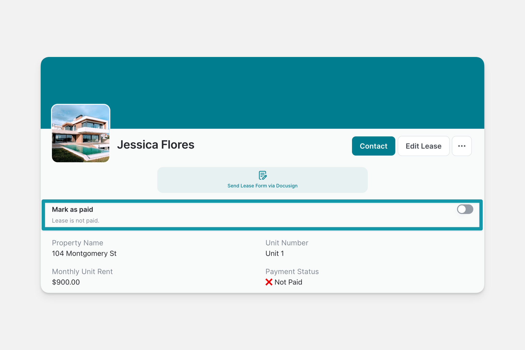
We use cookies to improve our service. Learn more.

Reference / Components

Choice Component

Pick options from a list

Meet the new Glide Apps

Glide Pages are now Glide Apps. Please refer to this article for up-to-date information, as some of this documentation is outdated.

The Choice component allows users to select an option from a predefined list.

Use case of the choice component

Use case of the choice component

Configure a Choice component

Configuring the Choice component

Configuring the Choice component

Data

In the Write to field, select the column from your Data Source where you want the choices to be recorded. If you are using the choice component within a Form, you'll also be able to set a default value that pre-fills this field. This remains editable by the user.

Setting the default value in the Show Form action

Setting the default value in the Show Form action

Content

Select the Source table that contains the options to be displayed. For Values, choose the column that contains the options users will pick from. If you'd like to display an image and/or alternate text in your choice, you can also configure the Images and Display as options.

Design

You can add a Label to the Choice component to provide direction. You can also select a Style between Dropdown, Chips, and Radio Button

Adding the label and choosing the Chips as the Style

Adding the label and choosing the Chips as the Style

If you've selected the Dropdown style, and your list of choices is over 9 items, a search bar will automatically be added to allow people to search your choices.

Options

  • You can limit the number of choices displayed.
  • If you're using the choice component within a Form, you can set the choice to be Required. This means that the user will not be able to submit unless they've selected one of the options.
  • You can also configure Allow selecting multiple to let users select more than one of the options displayed. The multiple selections will be stored in your data source (in the column chosen as the Write to column) as a comma-separated value. This is particularly useful when you want to filter list items that include the users' selection(s).

Configuring the Options section

Configuring the Options section

Enable Options settings

Visibility

You can define when your choice will be displayed by creating specific conditions. In the Visibility section, click the Add Condition button to create your conditions.

Filter data

You can filter the choices displayed based on their properties. In Filter Data section, click the Add Filter button to create your filters.

Sort data

By default, choices appear in the same order as they are in your data source. However, you can customize this so that choices are sorted according to specific criteria. In the Sort section, click on the Sort by Sheet order field to open the menu and configure your sort options.

Updated 3 days ago
Was this helpful?