
It's extraordinarily tough to capture the special spark that makes a company unique. It glitters in the company's most remarkable moments—when a customer is delighted, when there's a breakthrough in the product, when a meeting hums with creativity—but catching it and defining a brand around it requires a rare combination of precision and poetic license.
Today we're sharing Glide's updated brand—our special spark, captured and made explicit. Our goal is to portray Glide as visionary, uplifting, and intelligent, and become the most recognizable no-code brand.
After interviewing our customers and colleagues to understand what Glide means to them, we turned to industry comparisons to understand how Glide contrasts with adjacent companies. We found that other no-code companies looked quite similar to each other. This clarified our opportunity to present Glide as a visionary leader in the no-code space.
"The unstoppable Genius"
"The unstoppable Genius" is our brand persona. It expresses the bold, visionary approach that we felt was missing from the no-code space. The genius we are referring to can be viewed in two ways:
- The genius in all of us–the spirit of creativity and innovation that always seeks a better way–that Glide helps us discover and unleash.
- Glide is an unstoppable genius, relentlessly exploring bold new ideas that move the company and our customers forward.

To us, genius is made up of three thematic values: visionary, uplifting, and intelligent. These three values became a bit like a mantra for the team. Every step of the way, we’d stop to ask ourselves, "does what we’re creating or communicating feel visionary, uplifting, and intelligent?" If the answer was "no," we'd push to better align the work with these values.
The pitfall of trends
One approach to crafting a brand is to check out what's trendy today, and rework those trends into a brand that feels just differentiated enough.
That’s not the approach we took–we understand that being aware of trends is important, but they quickly become passé in our ever-evolving digital landscape. Used wisely, trends can make your brand feel contemporary, but using them as foundation makes your brand feel like a follower, rather than a leader.
Design process
We began our design process by trying to understand what would elevate and inspire our customers. Our approach was guided by what we wanted people to feel, not what we wanted them to see in the logo. We made sure to avoid anything too literal, leaning more into visuals that provoked emotion over heavy-handed metaphors.
For example: the new Glide symbol. What is it, exactly? For us, it evokes a sense of movement and energy. It feels visionary, uplifting, and intelligent. The symmetry of the two shapes feels coordinated and mathematical, while the tension of opposing curves suggests electricity or magnetism. It’s not a bolt, or a butterfly, or boomerangs; it's more a feeling than a thing.

Reverse inspiration
Another helpful approach to building our brand was to identify what we didn’t want Glide to feel like. Based on what adjacent companies were doing and what industry trends were already in decline, we formed a list of no-no’s for the new brand:
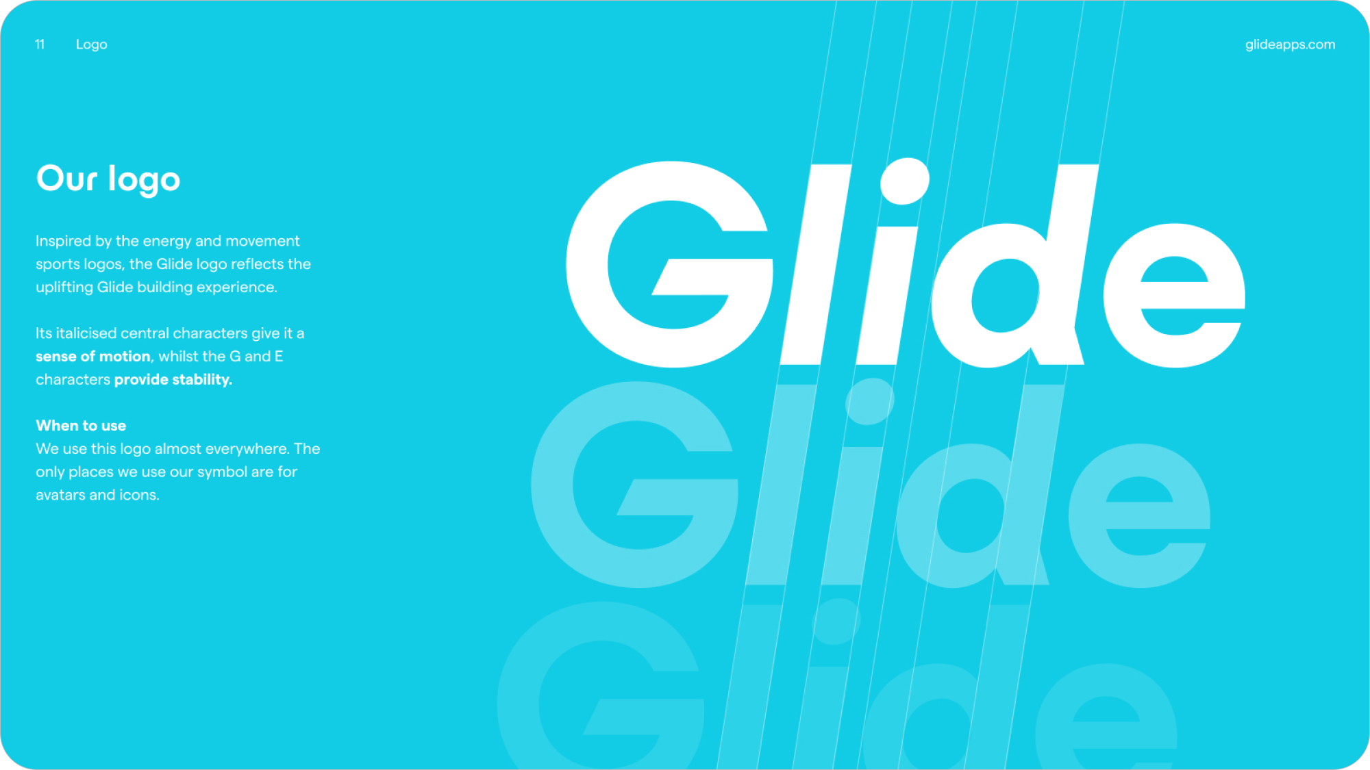
- No icon-left-wordmark-right lockup. We went against the grain by making a word-based logo that had enough personality to stand by itself, and could be replaced by our symbol at small scale.
- No primary-color icons. Since so many companies are fighting to own primary color palettes, it’s harder and harder to be a blue-red-green-yellow brand.
- No illustrations of people passing or stacking colorful blocks. A few years ago, this trend emerged as a friendly way to show software collaboration. Now it’s just too common.
- No ‘G’—sorry, it's taken.

Representing our users, and our users' users
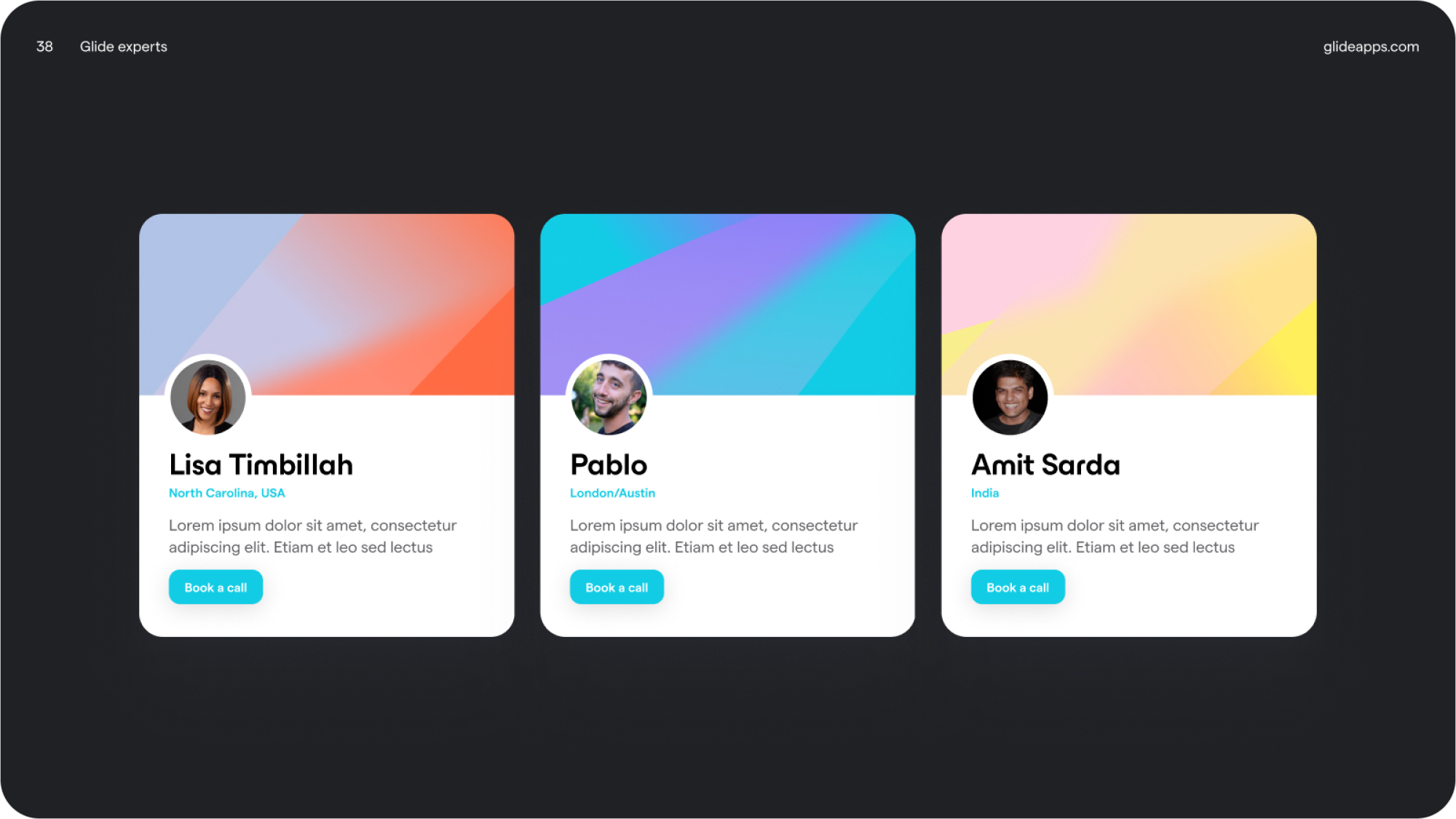
We used generated.photos, which uses AI to generate photos of people who do not exist, to make extremely convincing headshots for use in our templates and product marketing materials. These headshots look indistinguishable from real people and you won’t find our people in any other tools or websites, as they are generated uniquely for Glide.

What’s new
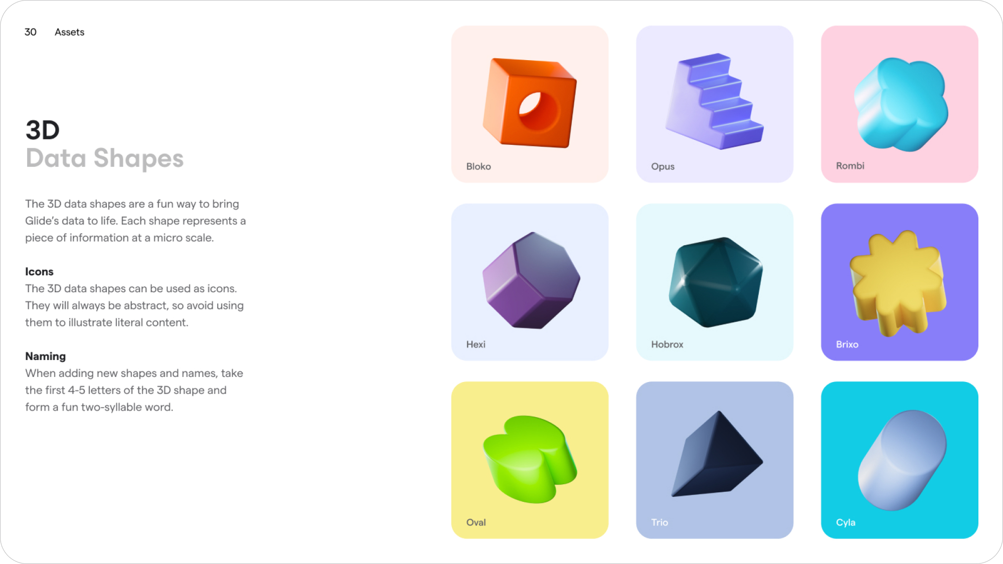
We’ve updated our logo, color palette, typography, visuals, and iconography to feel part of a coherent visual language. We’ve introduced a series of 2D and 3D visuals to give Glide a unique vibe, alongside a refreshed website.
What you’ll notice when using the product
We’ve updated the logo in the menu, but other than that, the product remains the same. Our new brand has been designed to complement our existing product, rather than smother it. The Glide you know and love is still the same.
Enjoy the fresh look!
Our new brand is a celebration of the self-starters and experts that make our product awesome, and we hope you love it. For more details, check out our brand kit. For any other brand related queries contact Tom, our Digital Art Director.


