
Images in Glide can appear in two primary places:
Components like the Title and Image component.
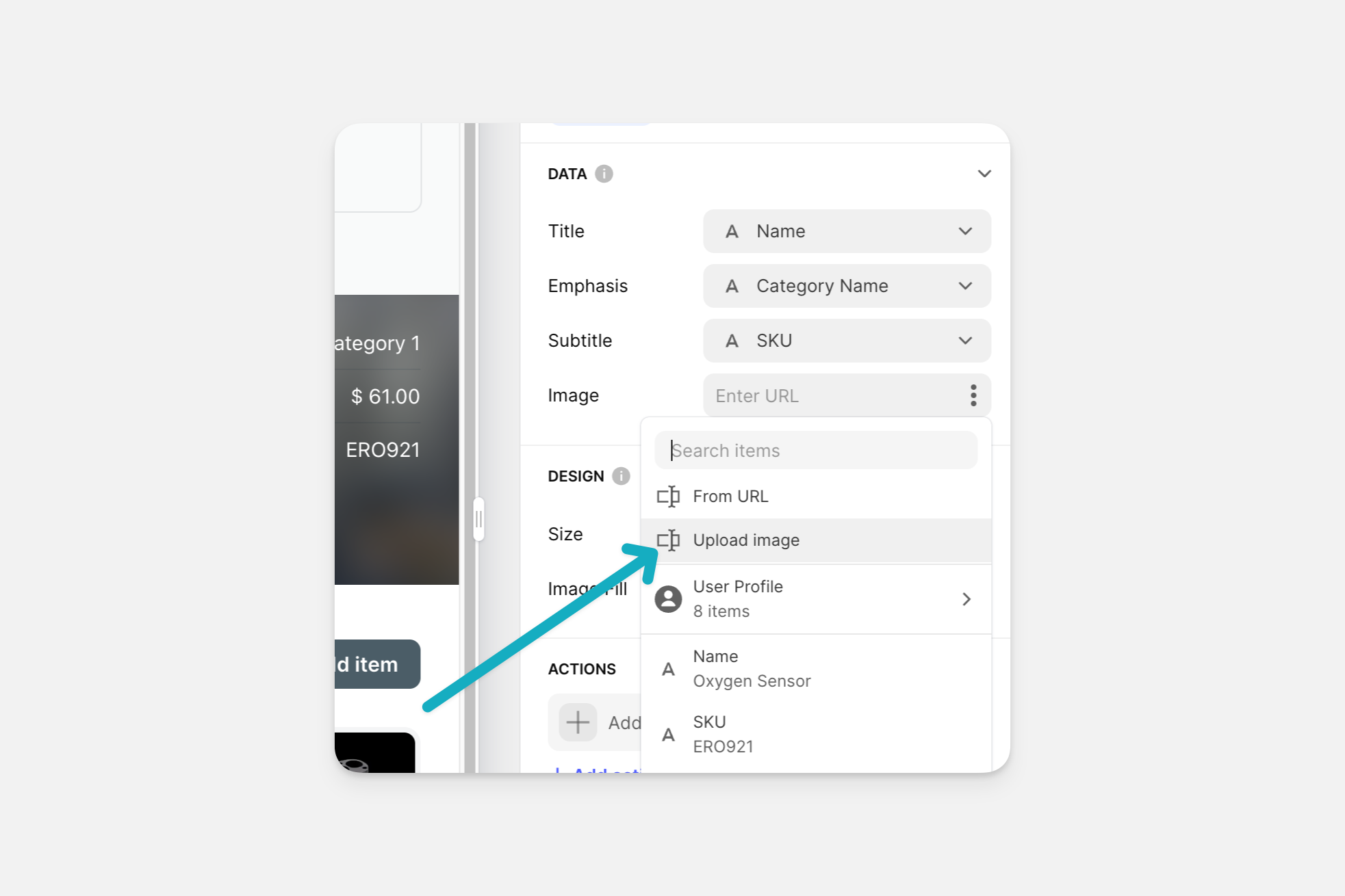
You can add images from a URL, upload your own, pick royalty-free ones from Pexels, and even allow users to upload their own images from within your app.
Image Hosting
The easiest way to add images to your app is by uploading them directly to Glide. You can upload images in an Image Column in the Data Editor, or you can drag and drop images directly onto components. This uploads the image to Glide's servers and inserts the correct link into your app automatically.
Unused Images in Apps
Note that images that are unreferenced in the Layout view by any app for 30 days will be automatically purged. If you use the Image or File Picker Component to allow image uploads, but then delete the row in your data where that image is stored, the image will disappear. If the row with the URL remains in the data editor, the image will not be deleted.
Direct URL
You can also add direct URLs to the Image Component without having to upload an image in the Data Editor. This allows you to save space on your storage quota if you have images hosted elsewhere.
It's possible to use an external service like Dropbox, Google Drive, or Imgur to host your images. However, we don't recommend hosting your images outside of Glide. While it's possible to make it work, services like Google Drive are not designed to share images in this way, and they do not scale well.
However, if you need to do this, all you need is a shareable link to your public image so that anyone with the link can view it.
For example https://www.somewhere.com/images/yummy_bacon.jpg
Image links must begin with https:// and not http://. In many instances, your phone will block http:// URLs.
Image component
The Image Component is the most customizable way to display images, compared to other components.
To show the original image without cropping it, select the Size 'Full' in the design setting on the right of the Layout Editor.
To show different size ratios for the image, pick any of the available ratios for the Aspect Ratio setting.
You can resize your image to fit any of the following aspect ratios:
Auto shows the image in its original size ratio.
Square shows the image in a 1:1 or square ratio.
4:3 ratio
16:9 ratio
3:1 ratio
You can also choose whether to align your image to the left, center, or right of the display.
Image Carousel
To create an image carousel in Glide, you can use a multiple image column as the source for an image component. The component will automatically become a carousel.
File types
Glide supports JPGs, PNGs, GIFs, and SVGs. Zipped or compressed files are not supported. The maximum file size for image uploads and app icons is 20MB.